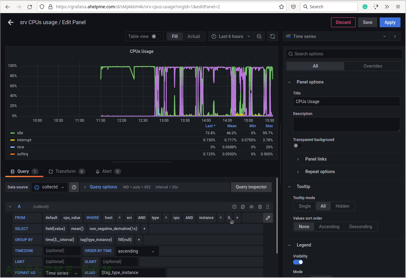
SCREENSHOT 40) Including the instance in the query, the graph may visualize per core measurements.
The test machine has only two cores, so there are instances 0 and 1.
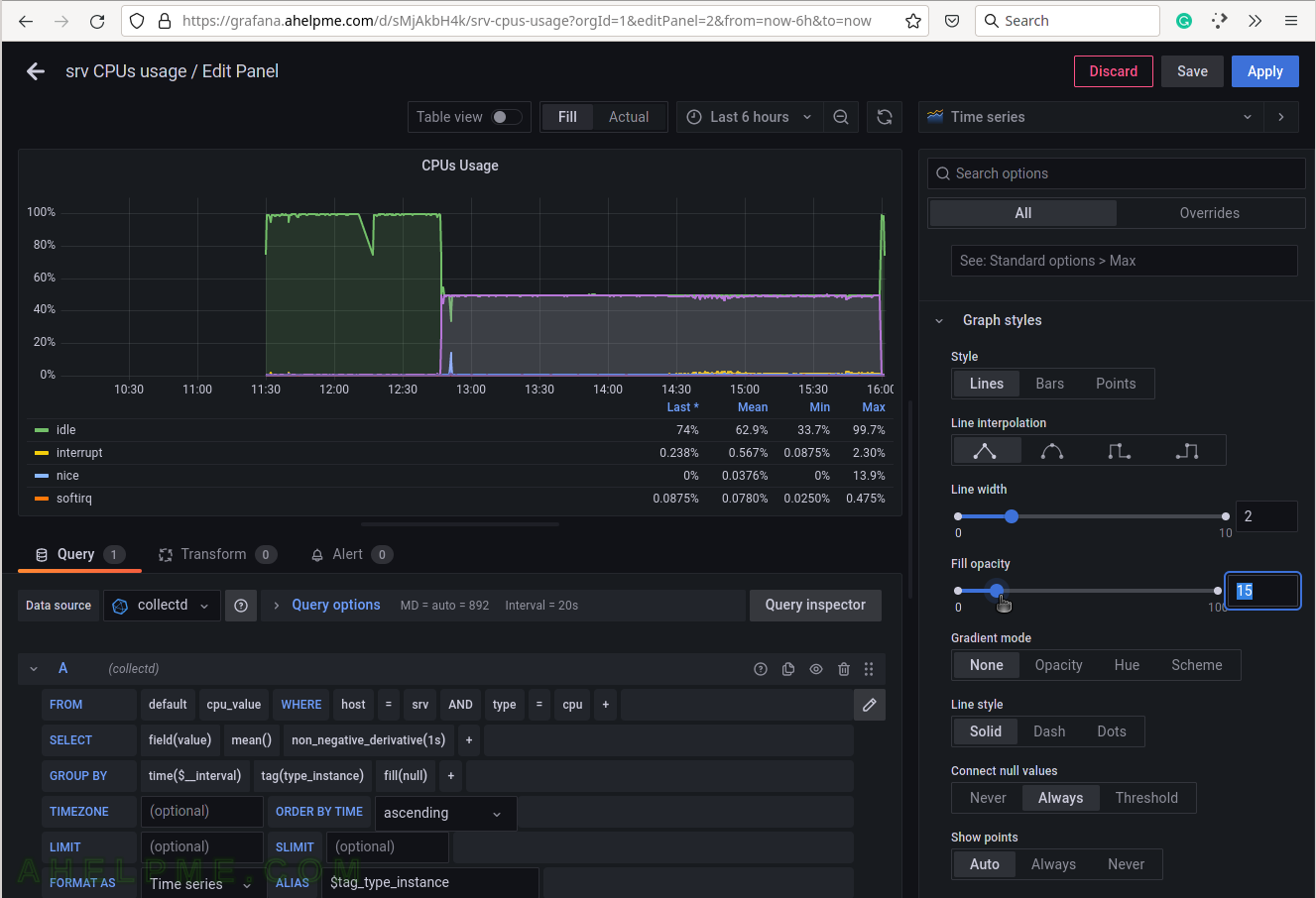
SCREENSHOT 41) Modifying the opacity of the graph.
The graph lines look better. The user can experiment with different style values.