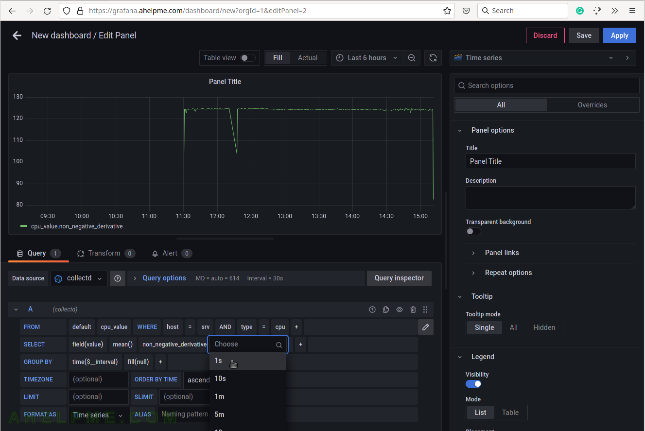
SCREENSHOT 10) Set the non_negative_derivative argument to 1s.
This is related to the rate of the measurement – jiffies and HZ.
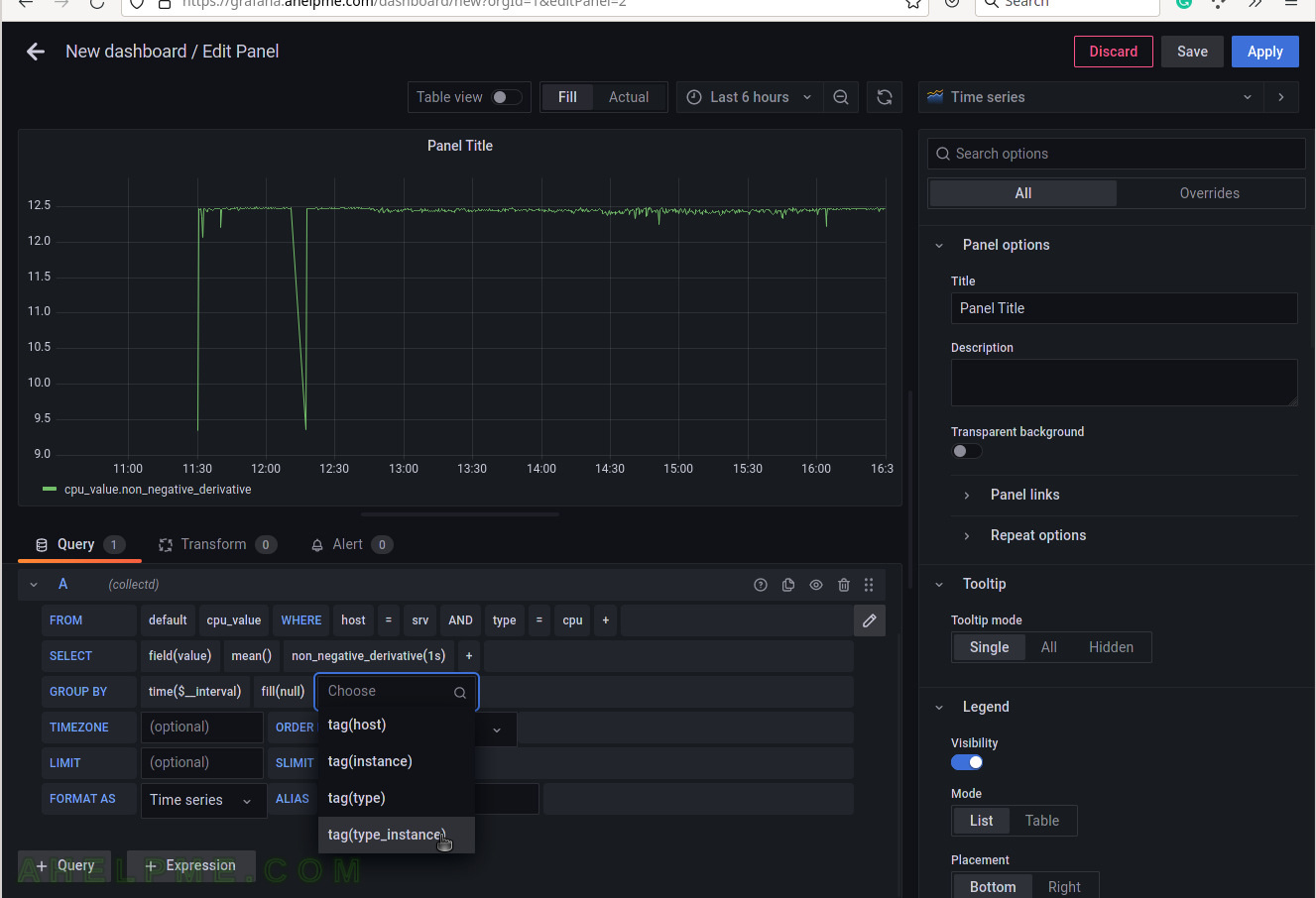
SCREENSHOT 11) Add a group by tag_instance to split the different tags in the graph.
There should be different lines for each tag – idle, interrupt, nice, softirq, steal, system, user and wait.
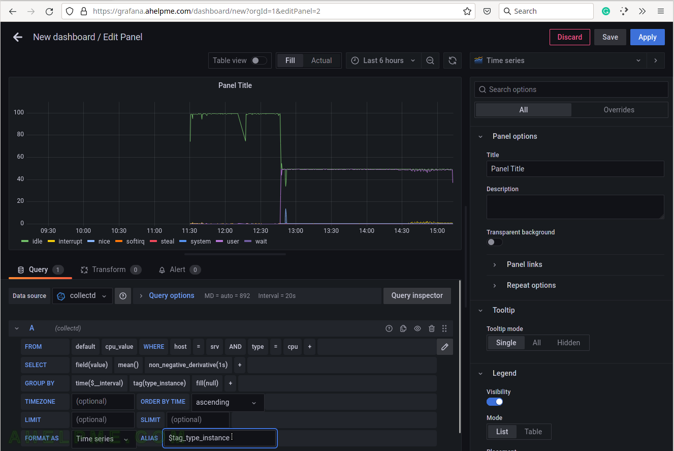
SCREENSHOT 12) To give pretty names to the tags in the graph’s legend add to the ALIAS a variable $tag_[tag_key] and in this case, the tag key is type_instance, so the variable will be $tag_type_instance.
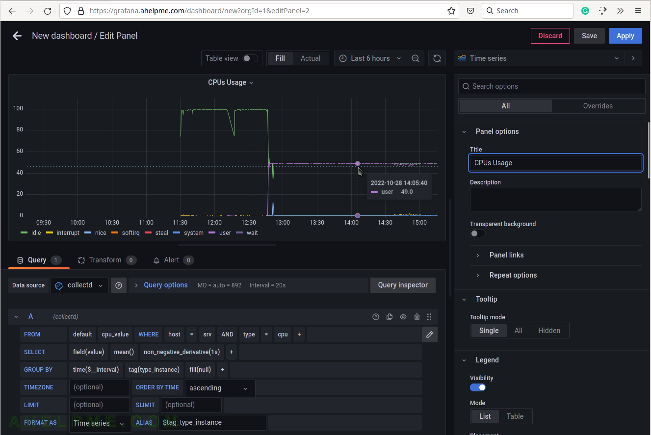
There is an important variable “$__interval“, which may be edited and set to the rate of the original data (if applicable, not really for the cpu usage) or left as is to be computed each time based on the selected time frame of the graph (6 hours for this example). There is a spike after 12:30. Hovering the mouse over the lines in the graph it will appear a tooltip with the values for the current time.
SCREENSHOT 13) Set the graph title to the right where is the graph options.
The query is ready and several graph options follow.
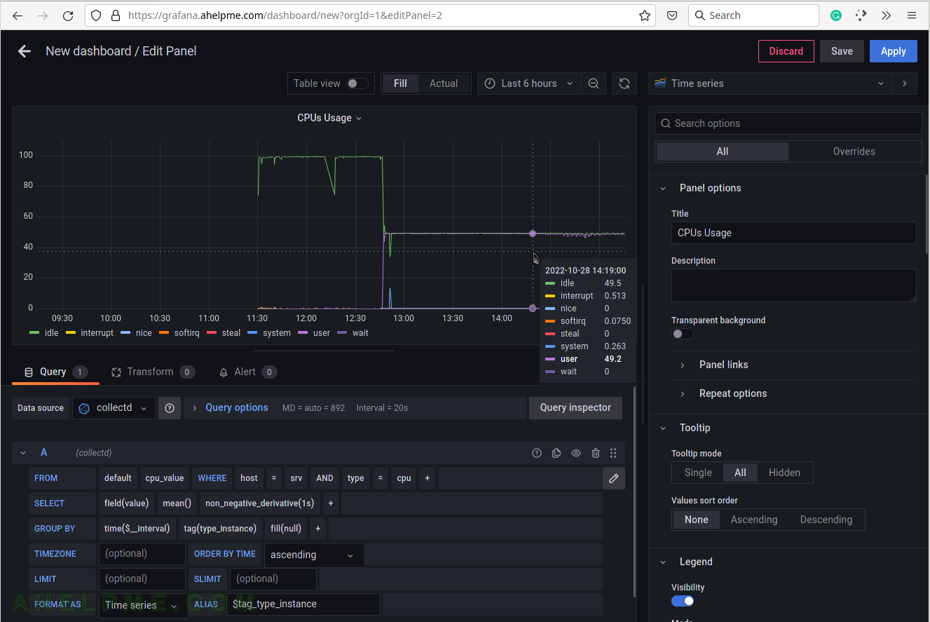
SCREENSHOT 14) Set the “Tooltip mode” to “All” to show all the queries’ results for a given time in the tooltip.
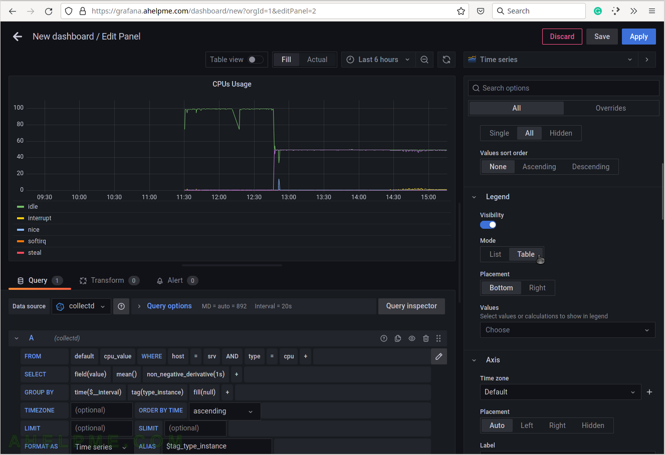
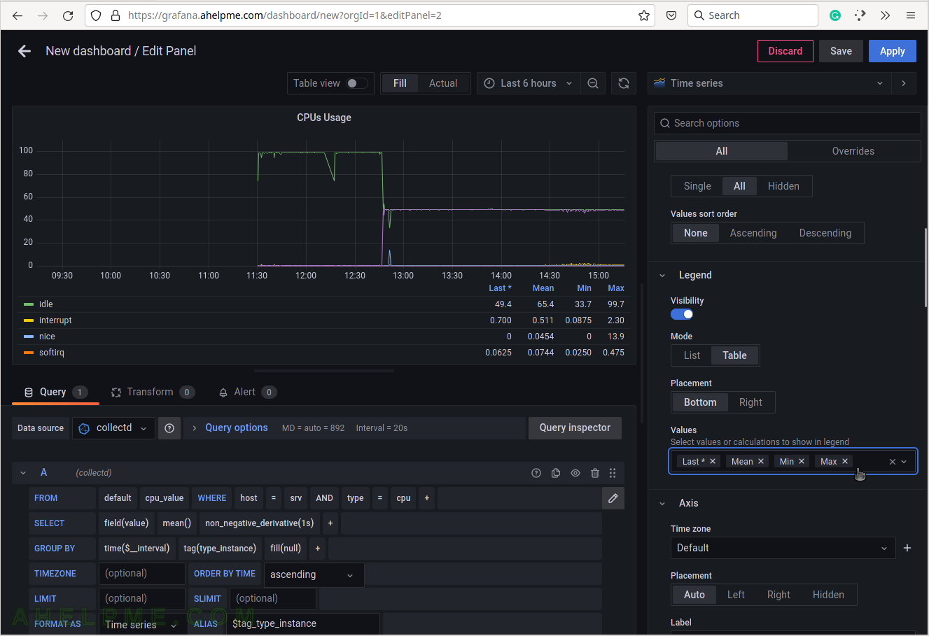
SCREENSHOT 15) Select the legend type “Table” for better visibility.
Scroll down if needed.
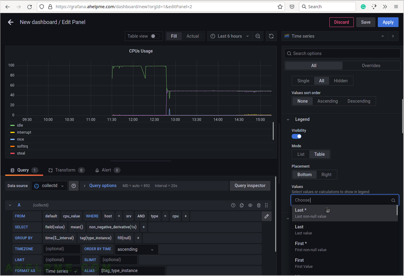
SCREENSHOT 16) Add additional values in the legend for the measurements like the current value of the measurements and so on.
Add “Last*” and select another values.
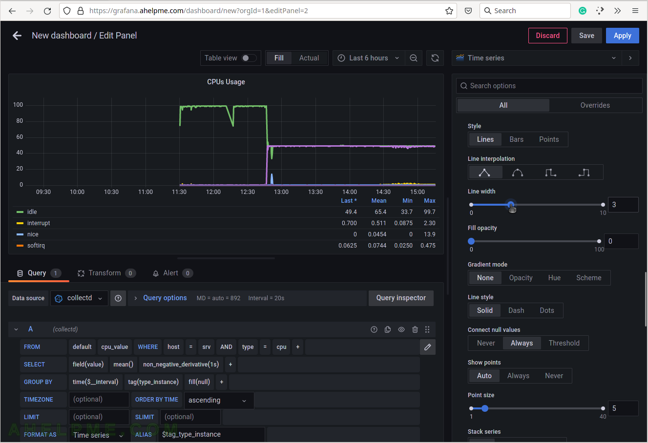
SCREENSHOT 17) 4 calculations are selected to be shown in the graph legend – Last, Mean, Min, Max.
These 4 calculations are meaningful for the current measurement – CPU usage. There are many more in the drop-down list.
SCREENSHOT 18) Scrow down to the Graphs styles sub-menu and chose “Always” for the “Connect null values”
If there are some missing values there won’t be gaps in the graphs.
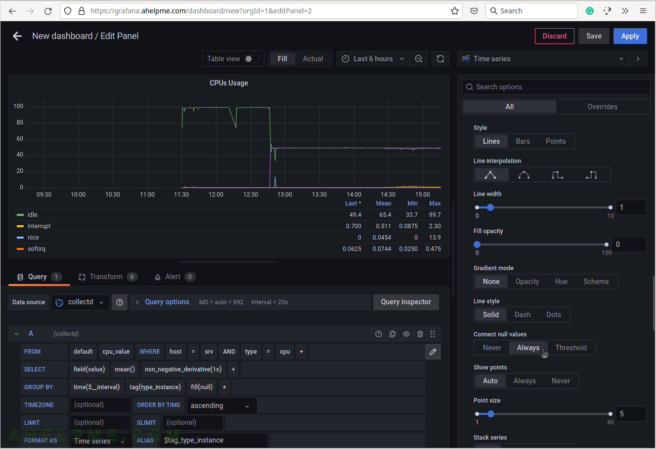
SCREENSHOT 19) Increase the lines width in the graph for better readability.