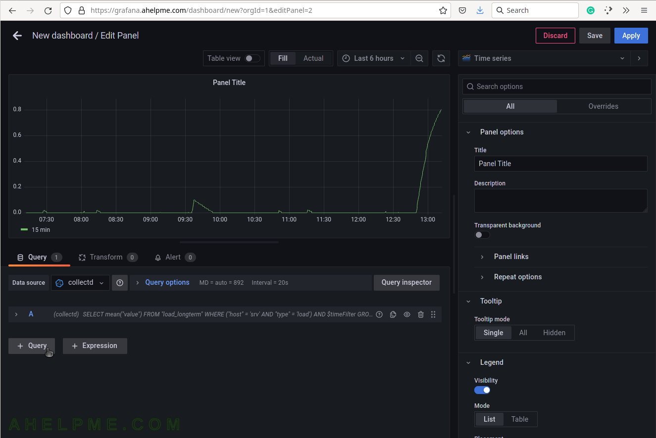
SCREENSHOT 11) Add another query to the same graph.
Click on the button “+ Query”.
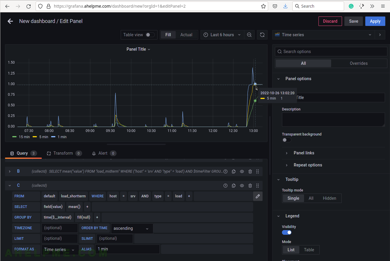
SCREENSHOT 12) Select load_midterm measurement and limit it by selecting the host and type.
Set the alias to “5 min” and add a third query “C”. Now, there are two lines in the graph.

SCREENSHOT 13) Select load_shortterm measurement and limit it by selecting the host and type.
Set the alias to “1 min” and add a third query “C”. Now, there are three lines in the graph for each query showing the Linux load average of 1,5,15 values.
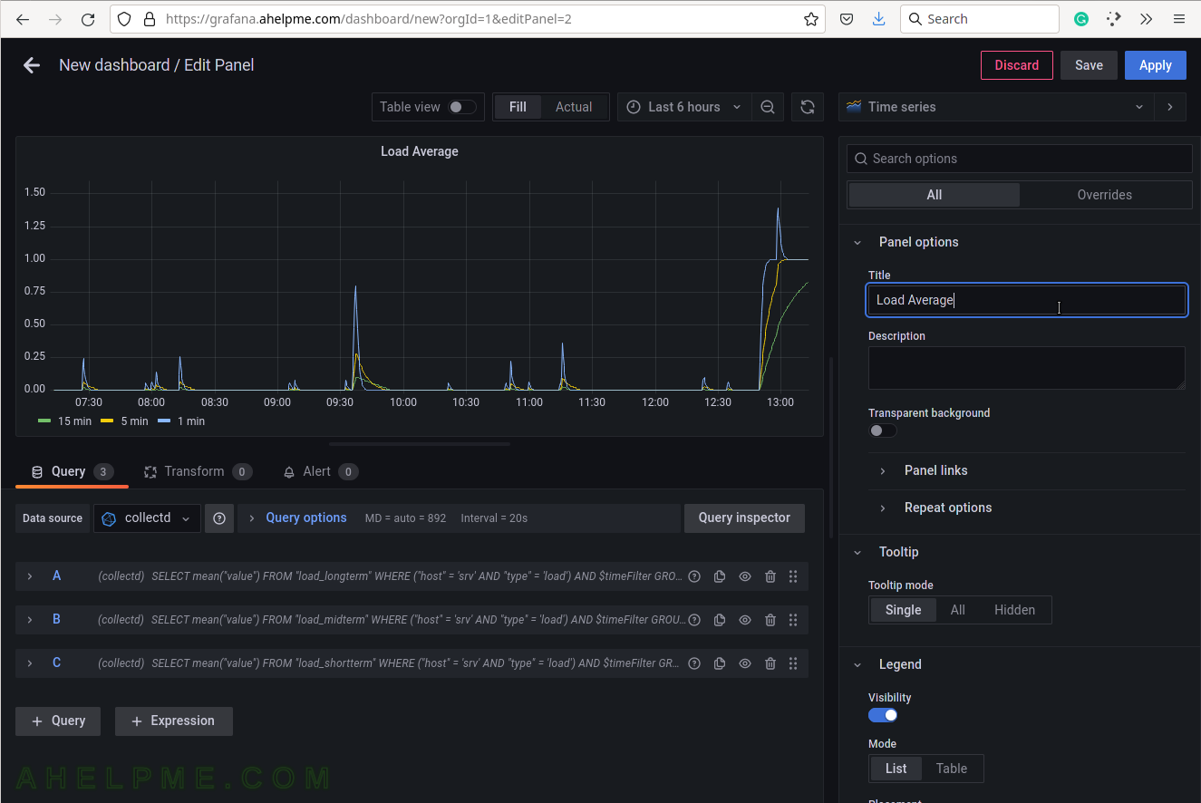
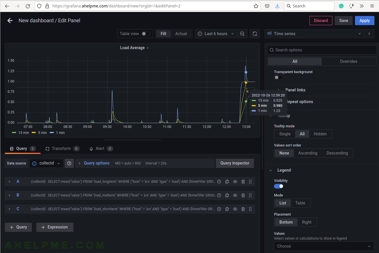
SCREENSHOT 14) Set the title of the current graph – “Load Average”.
SCREENSHOT 15) Set the “Tooltip mode” to “All” to show all the queries’ results for a given time in the tooltip.
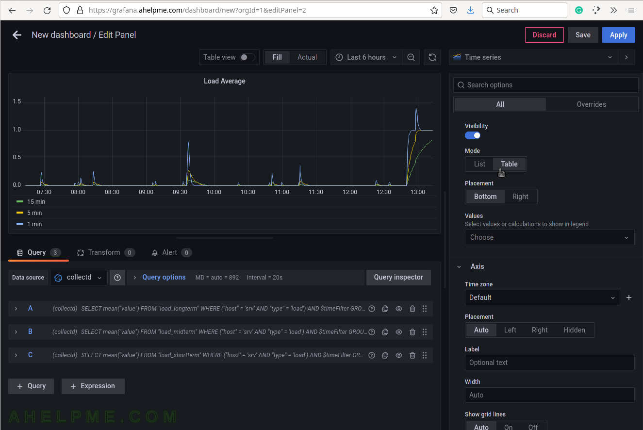
SCREENSHOT 16) Select the legend type “Table” for better visibility.
Scroll down if needed.
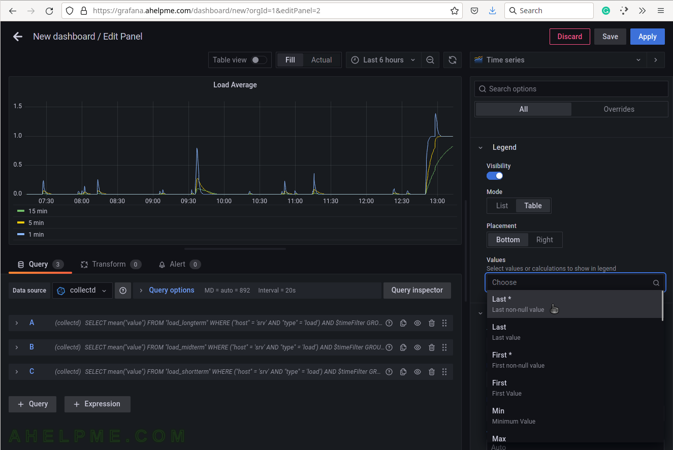
SCREENSHOT 17) Add additional values in the legend for the measurements like the current value of the measurements and so on.
Add “Last*” and select another values.
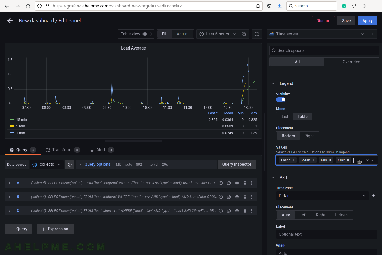
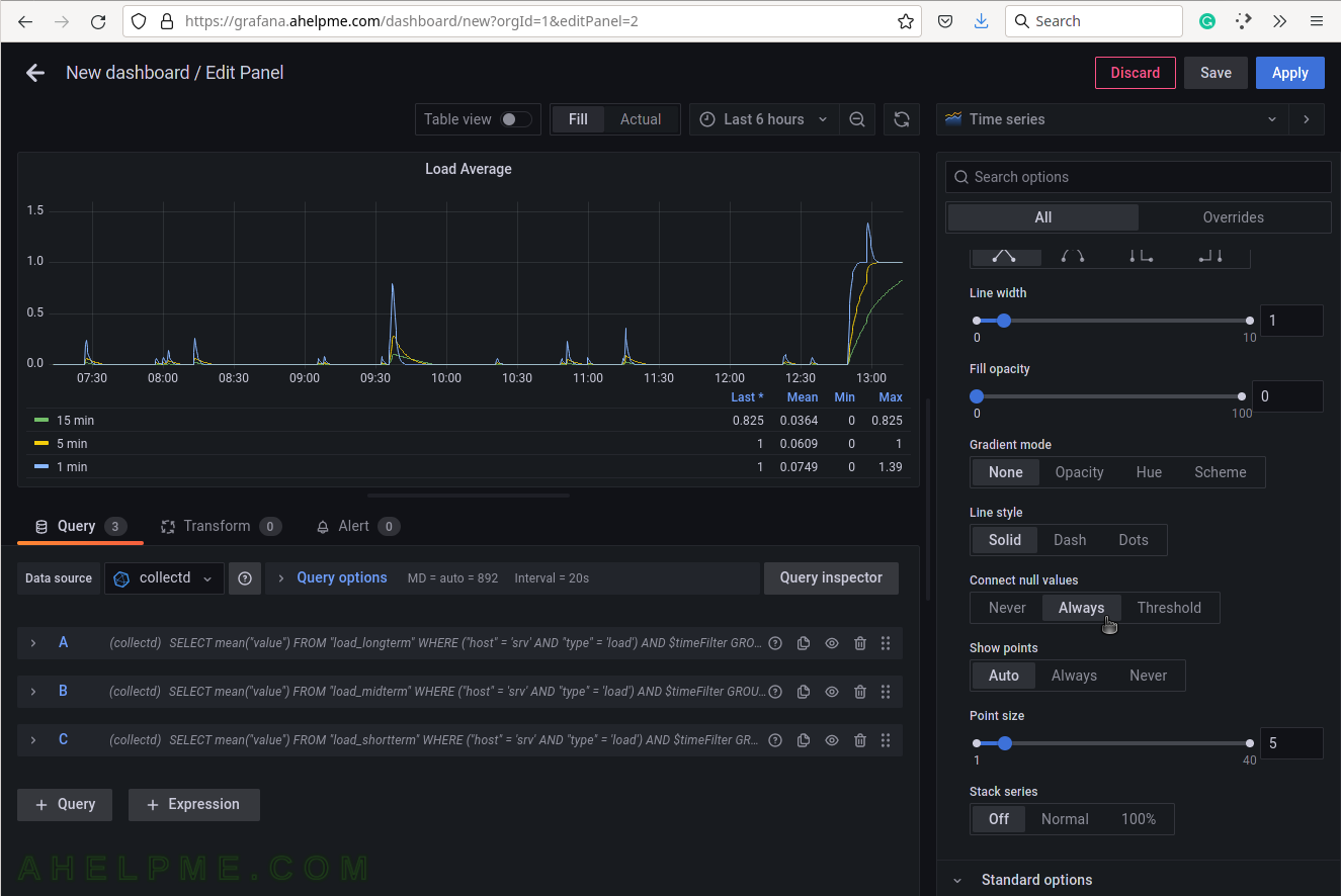
SCREENSHOT 18) 4 calculations are selected to be shown in the graph legend – Last, Mean, Min, Max.
These 4 calculations are meaningful for the current measurement – load average. There are many more in the drop-down list.
SCREENSHOT 19) Scrow down to the Graphs styles sub-menu and chose “Always” for the “Connect null values”
If there are some missing values there won’t be gaps in the graphs.
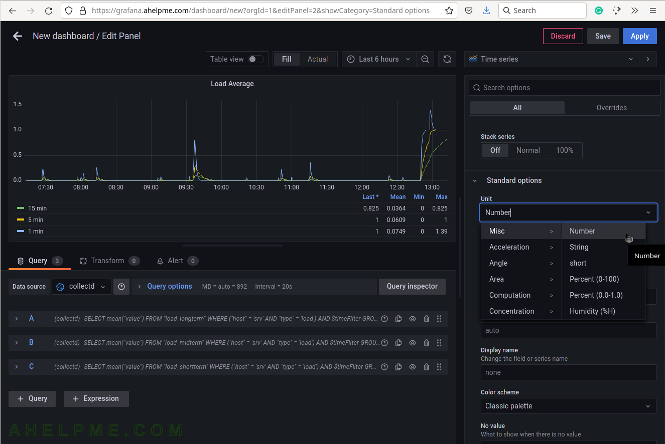
SCREENSHOT 20) The units of the load average are just a number.