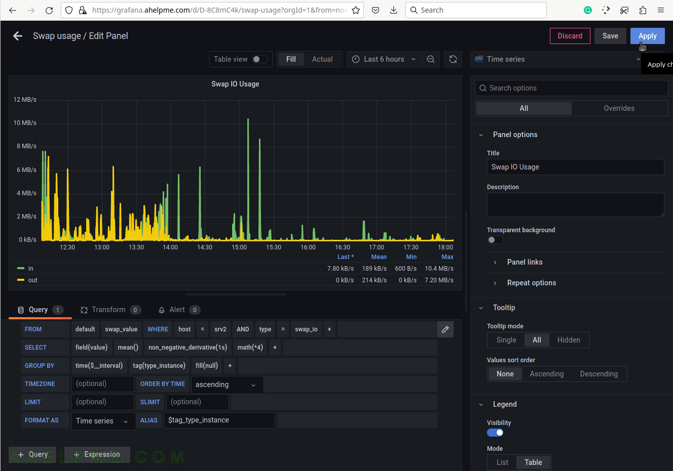
SCREENSHOT 51) Apply all the graph modifications.
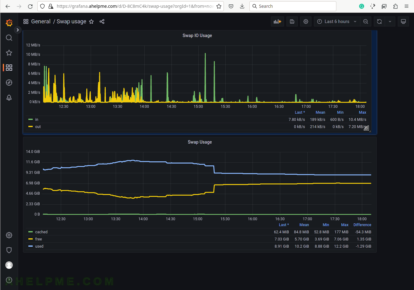
SCREENSHOT 52) Change the size of the panel if needed by hovering and clicking on the panel’s right bottom.
Move the mouse and the panel and the graph will expand.
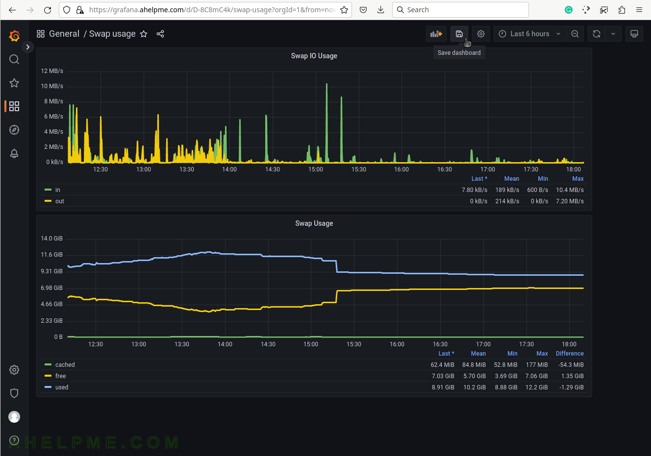
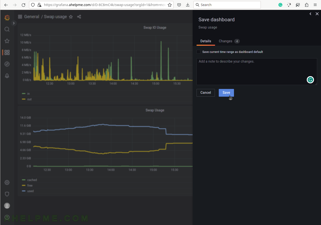
SCREENSHOT 53) Click on the “Save dashboard” to save the additional panel.
SCREENSHOT 54) Save the changes and add a description if necessary.
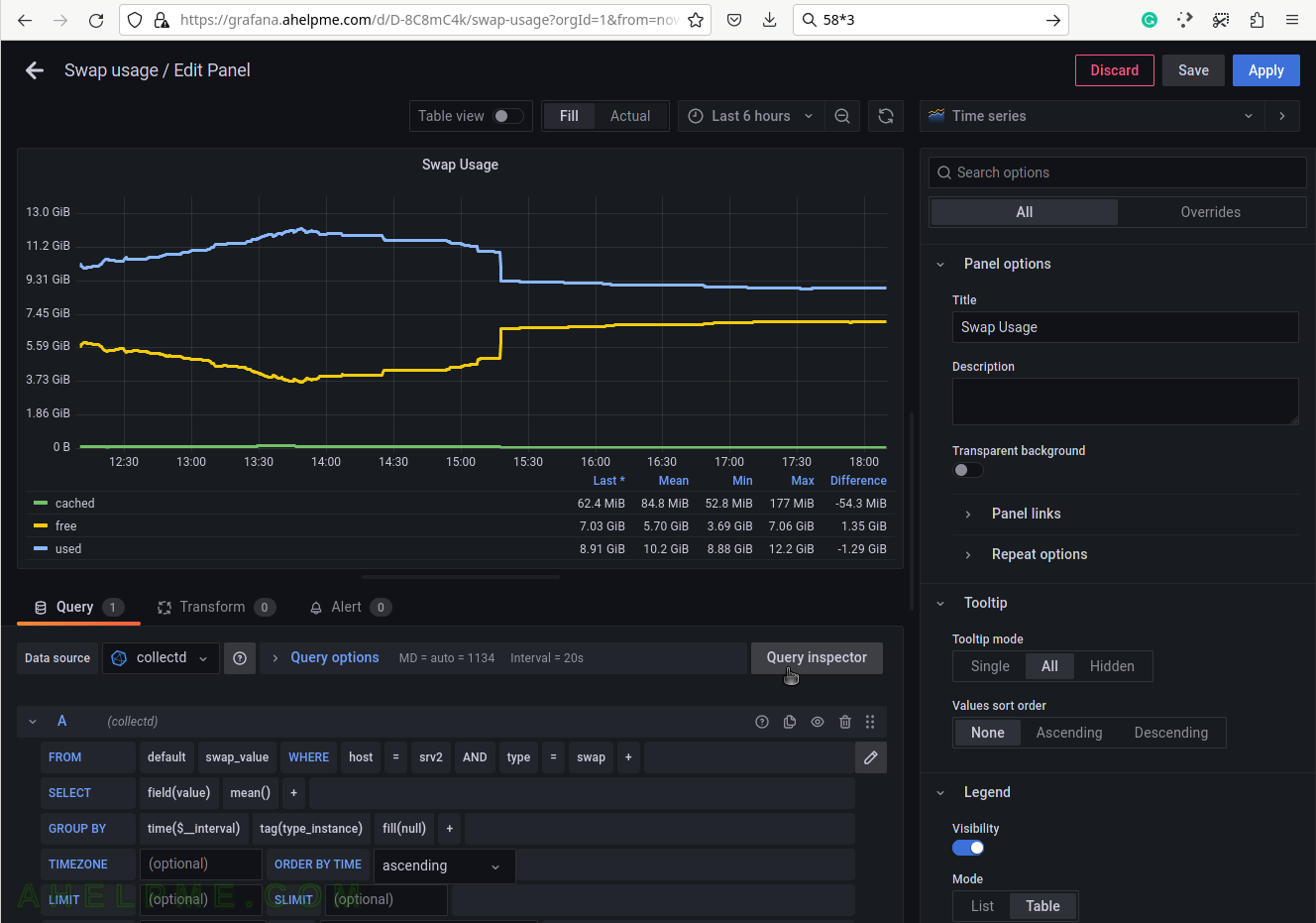
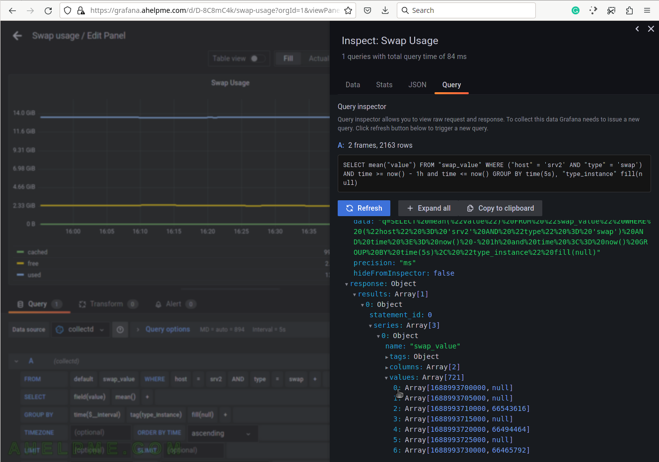
SCREENSHOT 55) Click on “Query Inspector” to see the values behind the graph and the query results or the real query sent to InfluxDB.
SCREENSHOT 56) The query in InfluxQL language, which is sent to the InfluxDB.
Some of the values are replaced with their actual values such as “$__interval“, which is based on what time frame is selected – “Last 6 hours”. If $__interval is not set on the query manually, it is a good idea to use the mean() function in the query (as in the example above).
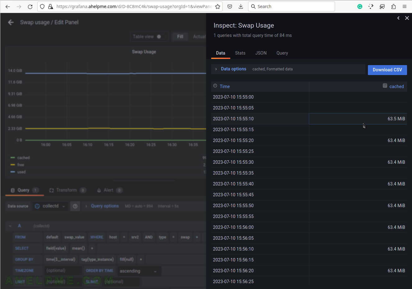
SCREENSHOT 57) The Data tab in Query Inspector shows real values from the queries in a table form.
Multiple values of the idle measurement are shown. These values may be cross-checked with the values from the special file /proc/meminfo.
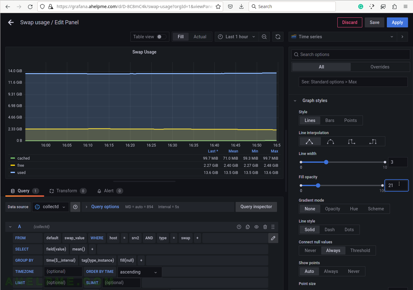
SCREENSHOT 58) Modifying the opacity of the graph.
The graph lines look better. The user can experiment with different style values.