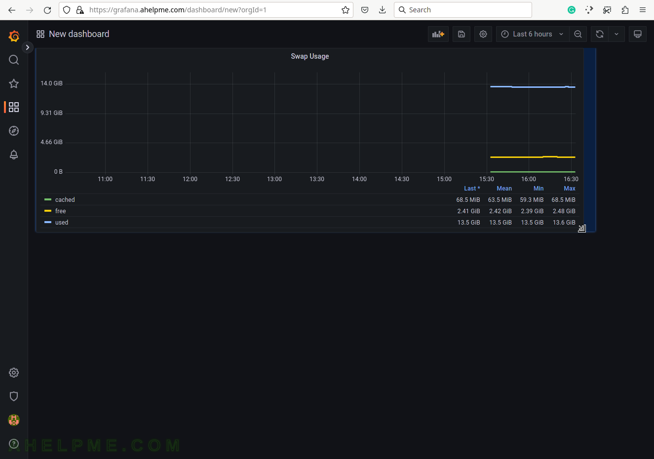
SCREENSHOT 21) Change the size of the panel if needed by hovering and clicking on the panel’s right bottom.
Move the mouse and the panel and the graph will expand.
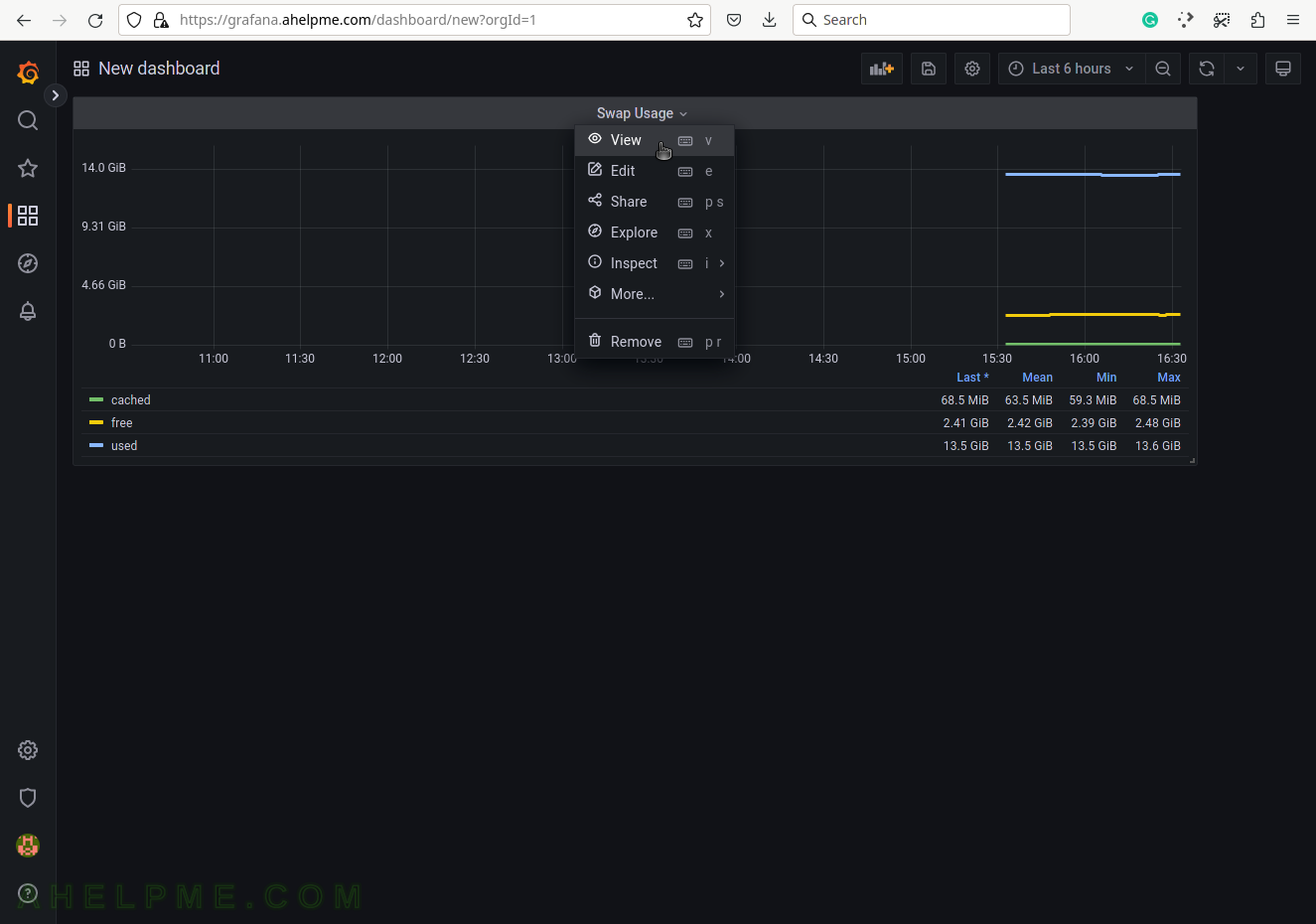
SCREENSHOT 22) The Swap usage sub-menus.
Click on sub-menu “View” to expand it. There are 6 more menu items – Edit, Share, Explore, Inspect, More… and Remove.
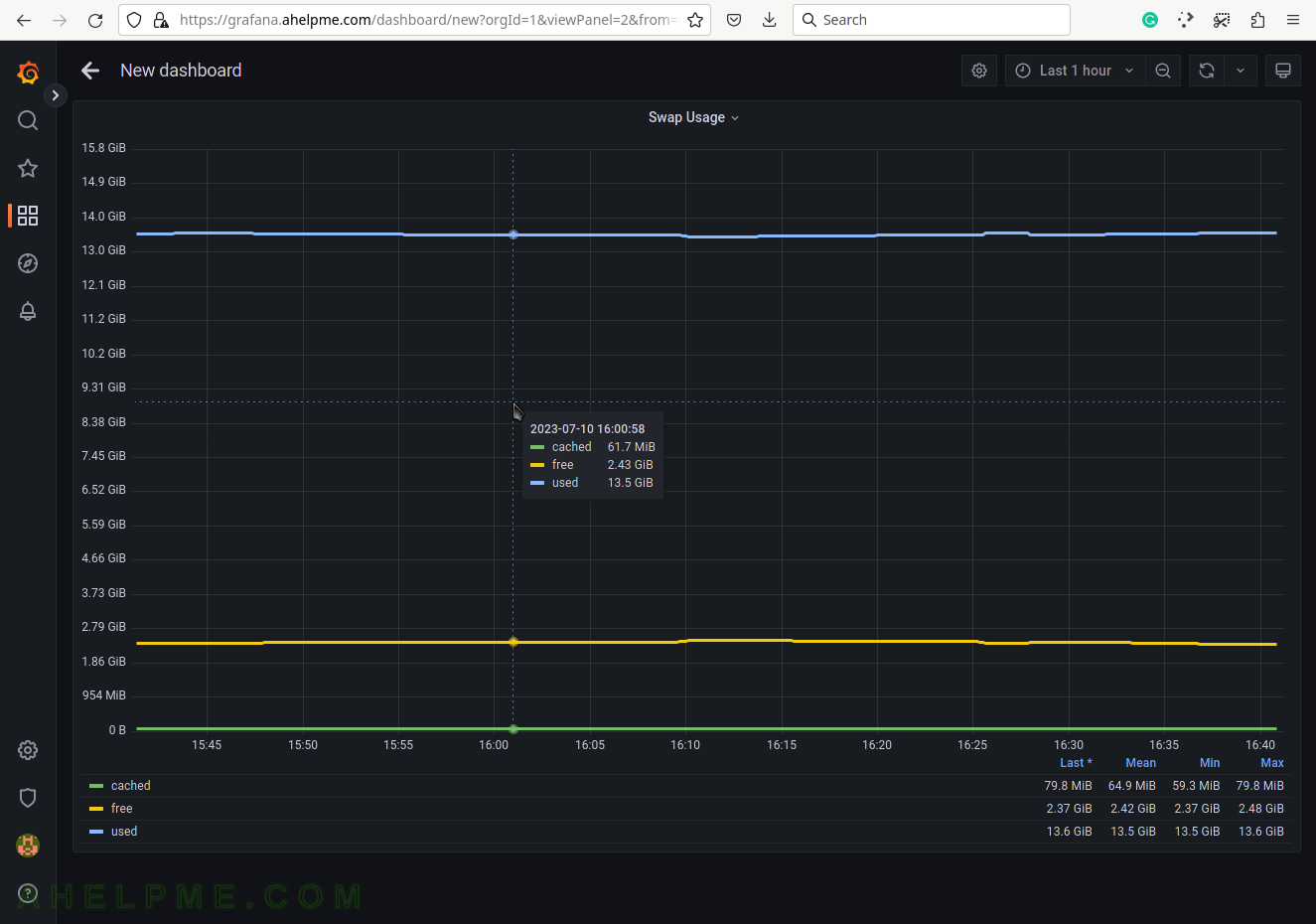
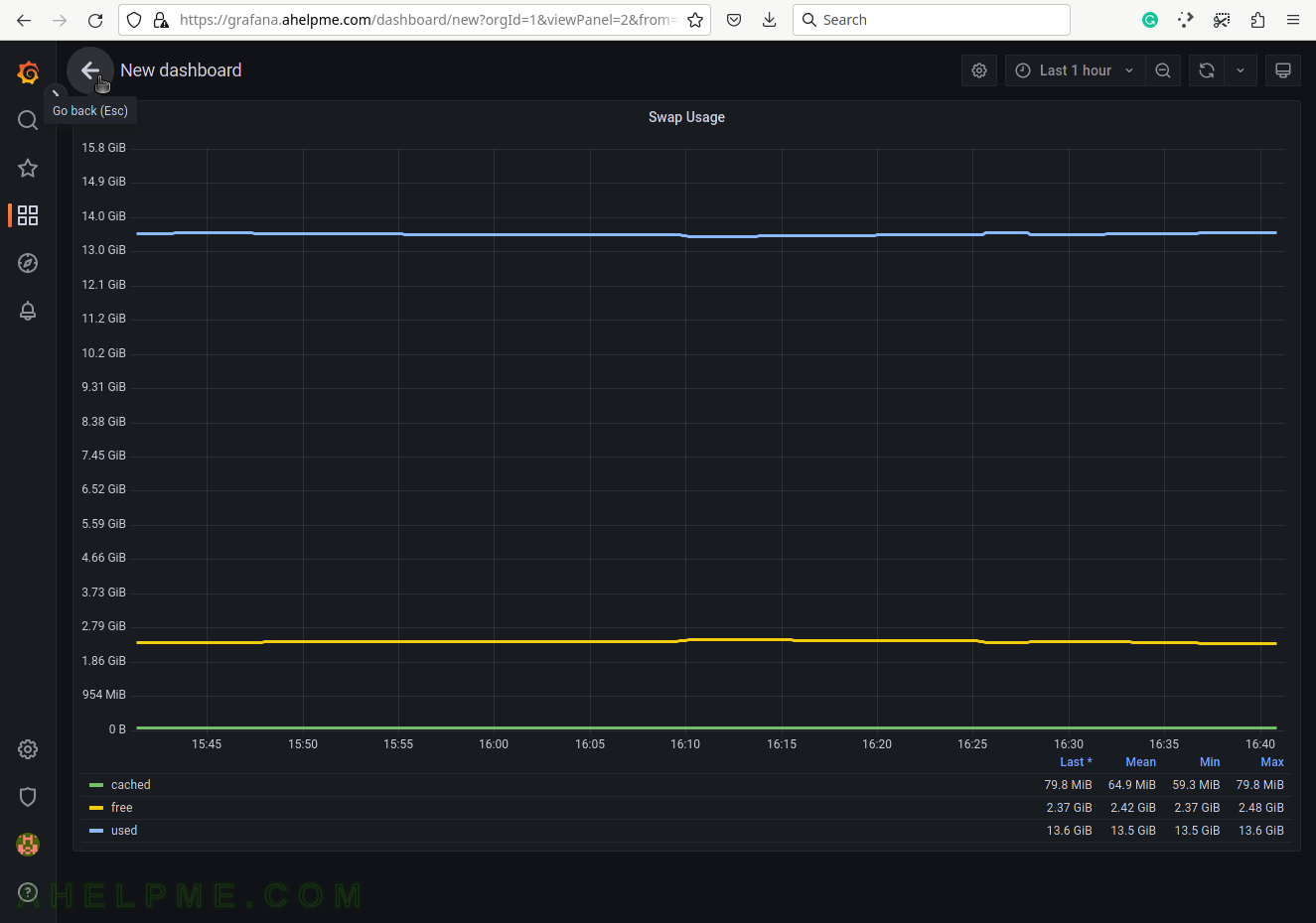
SCREENSHOT 23) There is a View mode, which will bring the graph as a full-page graph.
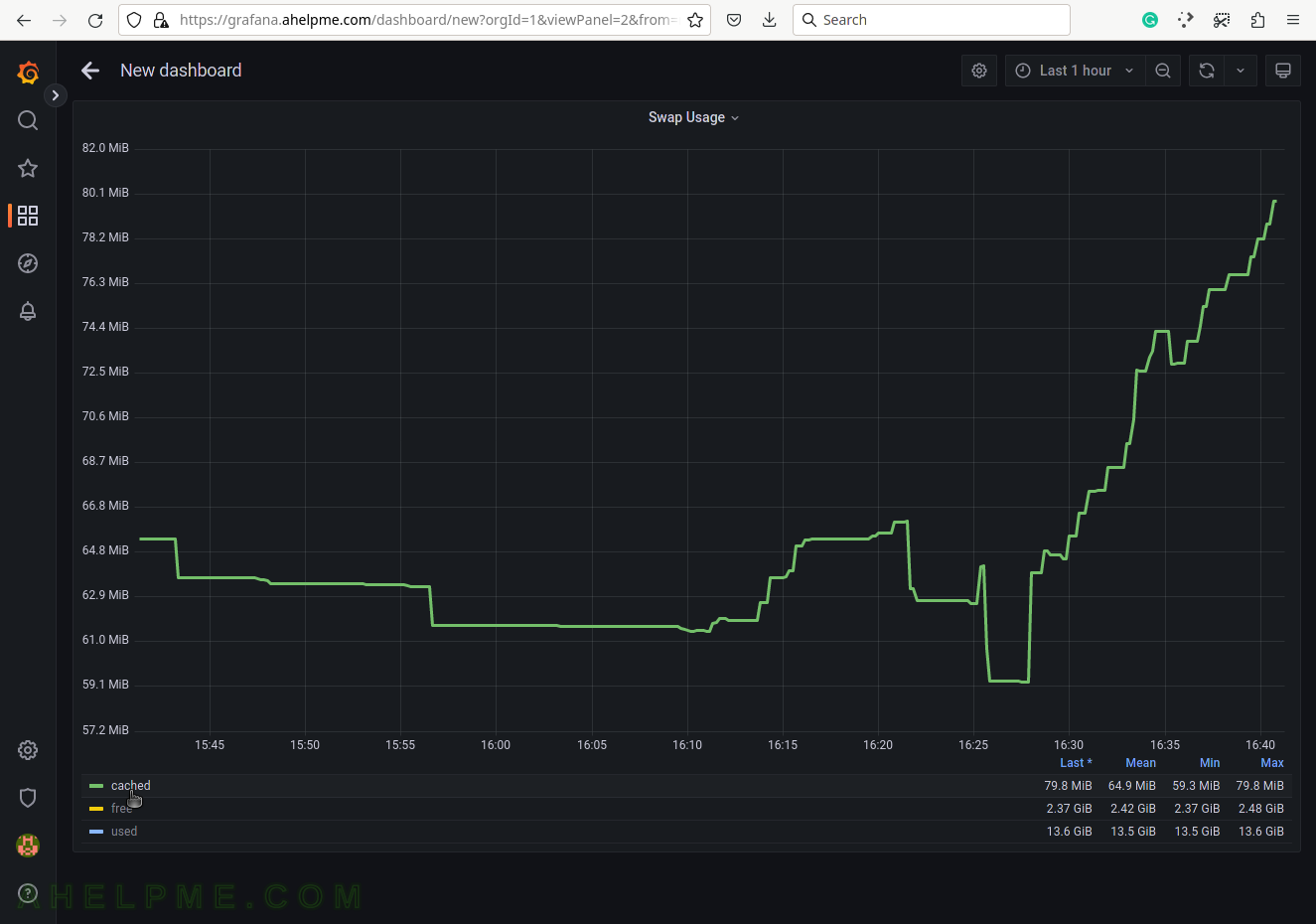
SCREENSHOT 24) By clicking on the cached in the legend all of the other Swap usage are hidden and the cached graph line is scaled in the graph.
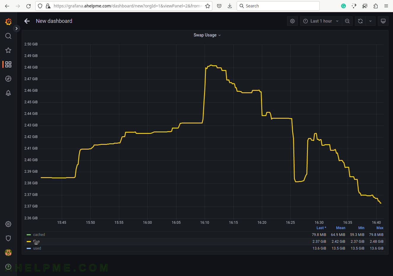
SCREENSHOT 25) By clicking on the free in the legend all of the other Swap usage are hidden and the free graph line is scaled in the graph.
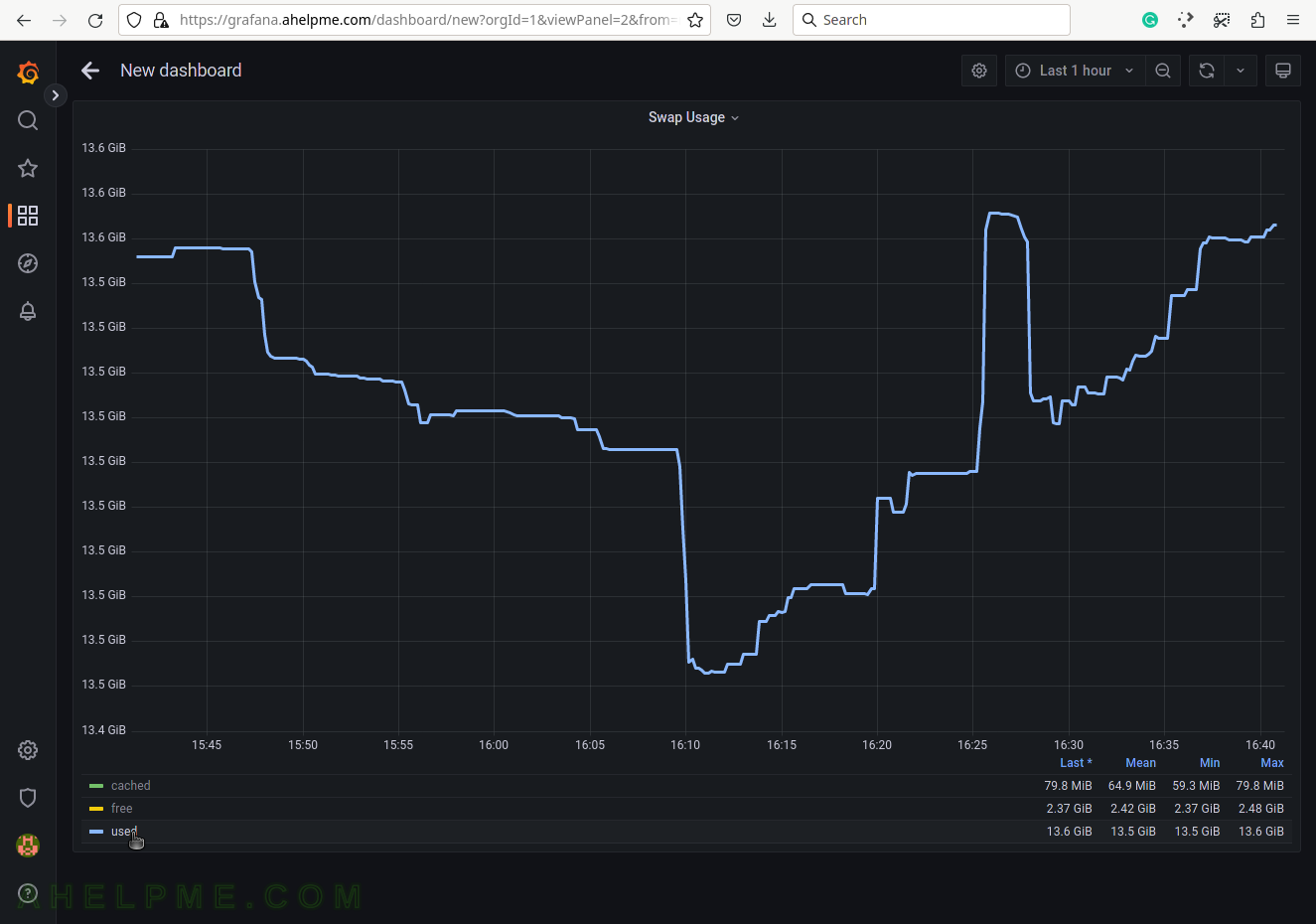
SCREENSHOT 26) By clicking on the used in the legend all of the other Swap usage are hidden and the used graph line is scaled in the graph.
SCREENSHOT 27) Then click on the back arrow in the left top corner to exit the View layout and save the dashboard.
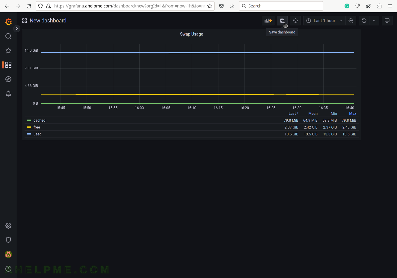
SCREENSHOT 28) Click on the right upper “Save dashboard” button to save the current dashboard.
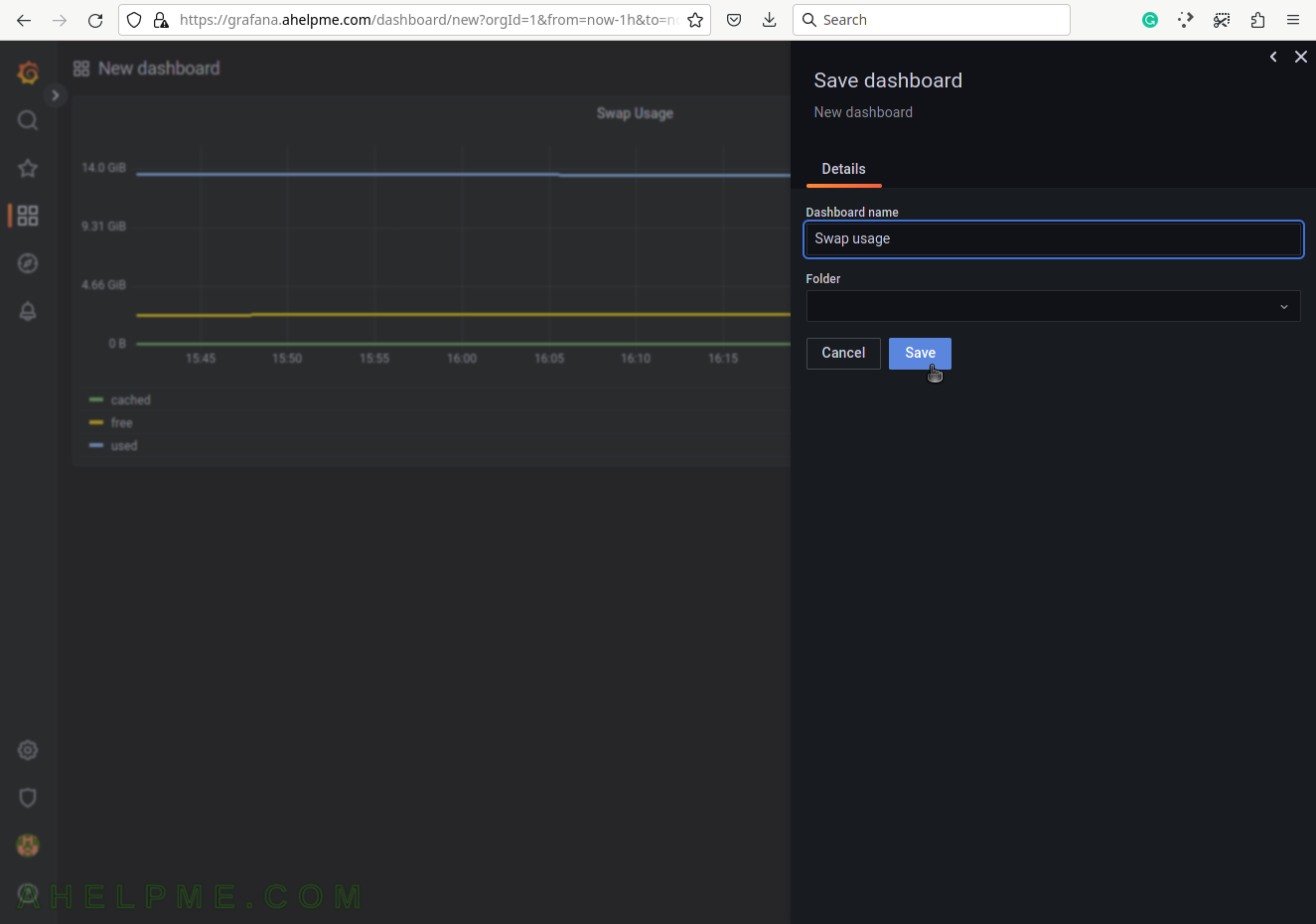
SCREENSHOT 29) Set the dashboard’s name and folder.
Click on “Save” to save all the graphs and the panel data of the newly created dashboard.
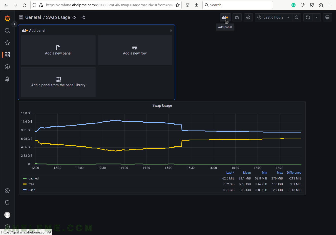
SCREENSHOT 30) Add a new panel in the new dashboard, which will contain the Swap usage graph.
The top right corner button “Add panel” will show the “Add panel” menu.