After the tutorial of Install Fedora 27 KDE Plasma Desktop this tutorial is mainly to see what to expect from a freshly installed Fedora 27 KDE Plasma Desktop – the look and feel of the new KDE GUI (version 5.12 of KDE Plasma).
The idea of this tutorial is just to see what to expect from Fedora 27 KDE Plasma – the look and feel of the GUI, the default installed programs and their look and how to do some basic steps with them, it is included also screenshots of the KDE settings program. Here you’ll find more than 160 screenshots and not so many text we do not want to turn this review of many text and version information and 3 meaningless screenshot, which you cannot see anything for the user interface, which these days is the primary goal of a Desktop system. You can expect more of this kind reviews in the future…
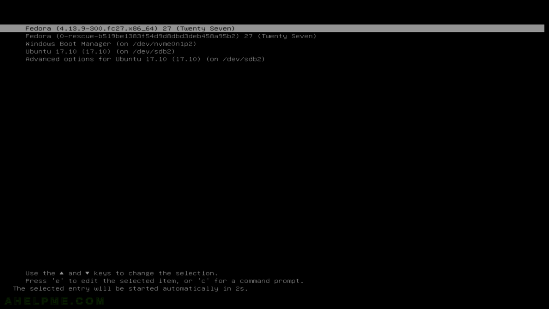
SCREENSHOT 1) Select and boot Fedora 27 KDE Plasma Desktop from our installed operating systems in grub menu
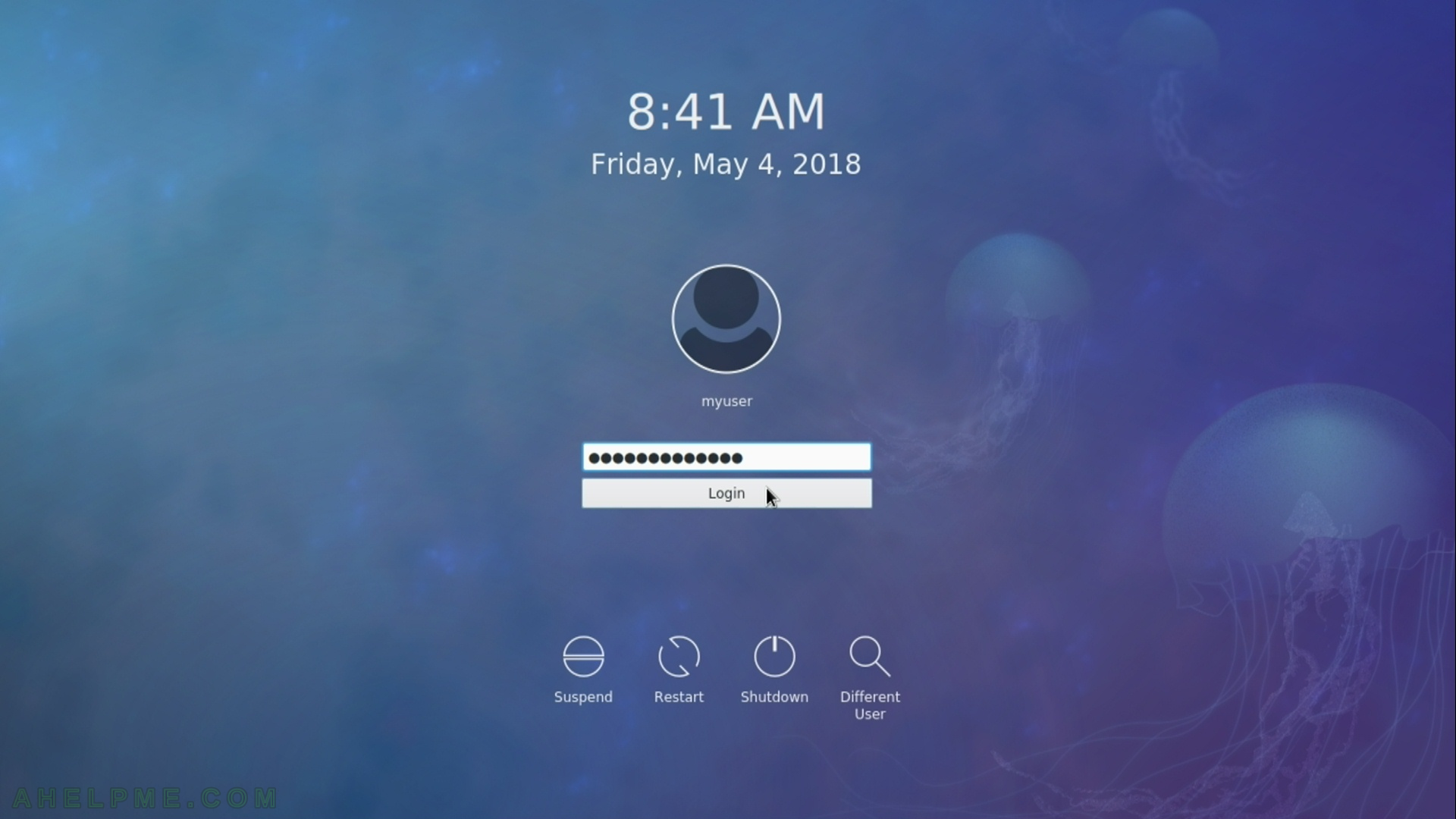
SCREENSHOT 2) Login screen of Fedora 27 KDE Plasma Desktop
SCREENSHOT 3) Welcome screen of KDE
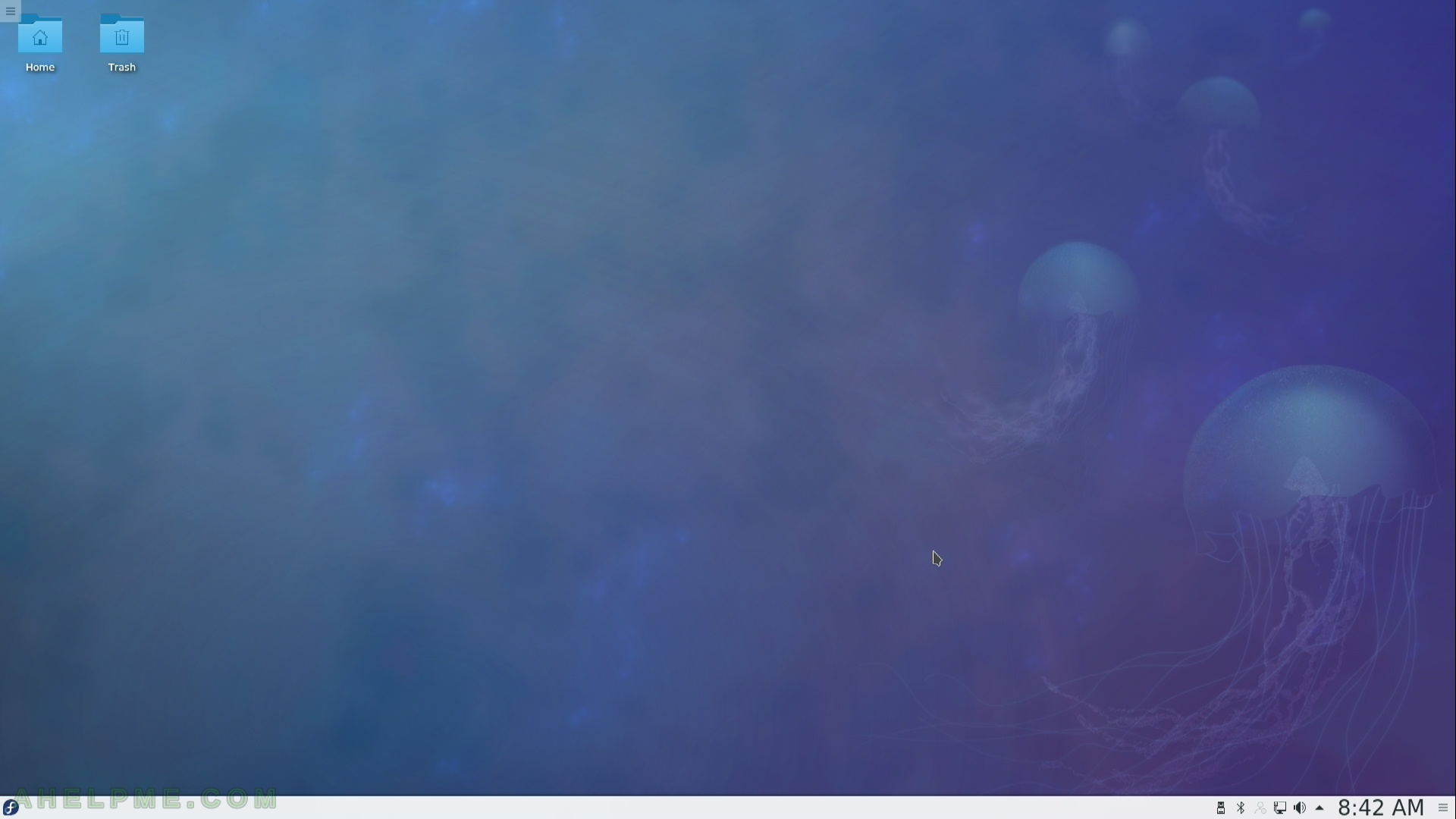
SCREENSHOT 4) And here is the desktop of your freshly installed Fedora 27 KDE Plasma Desktop.
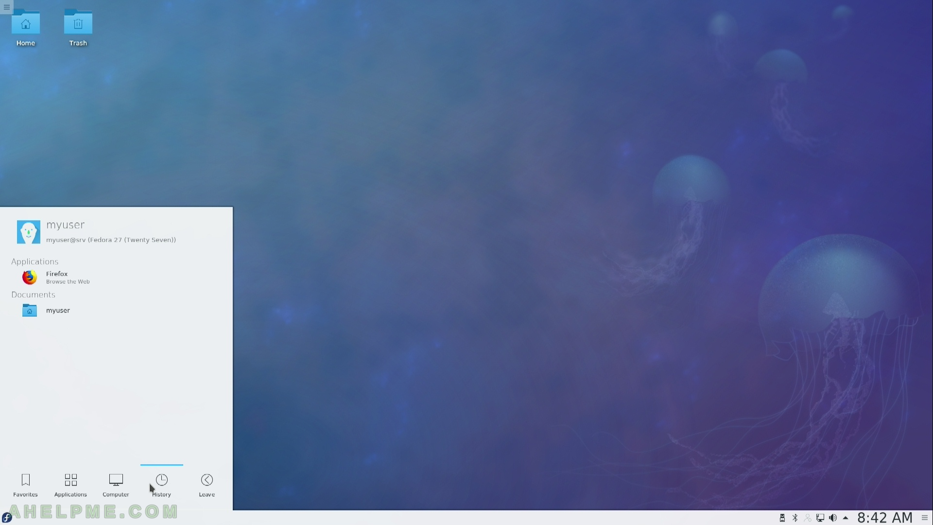
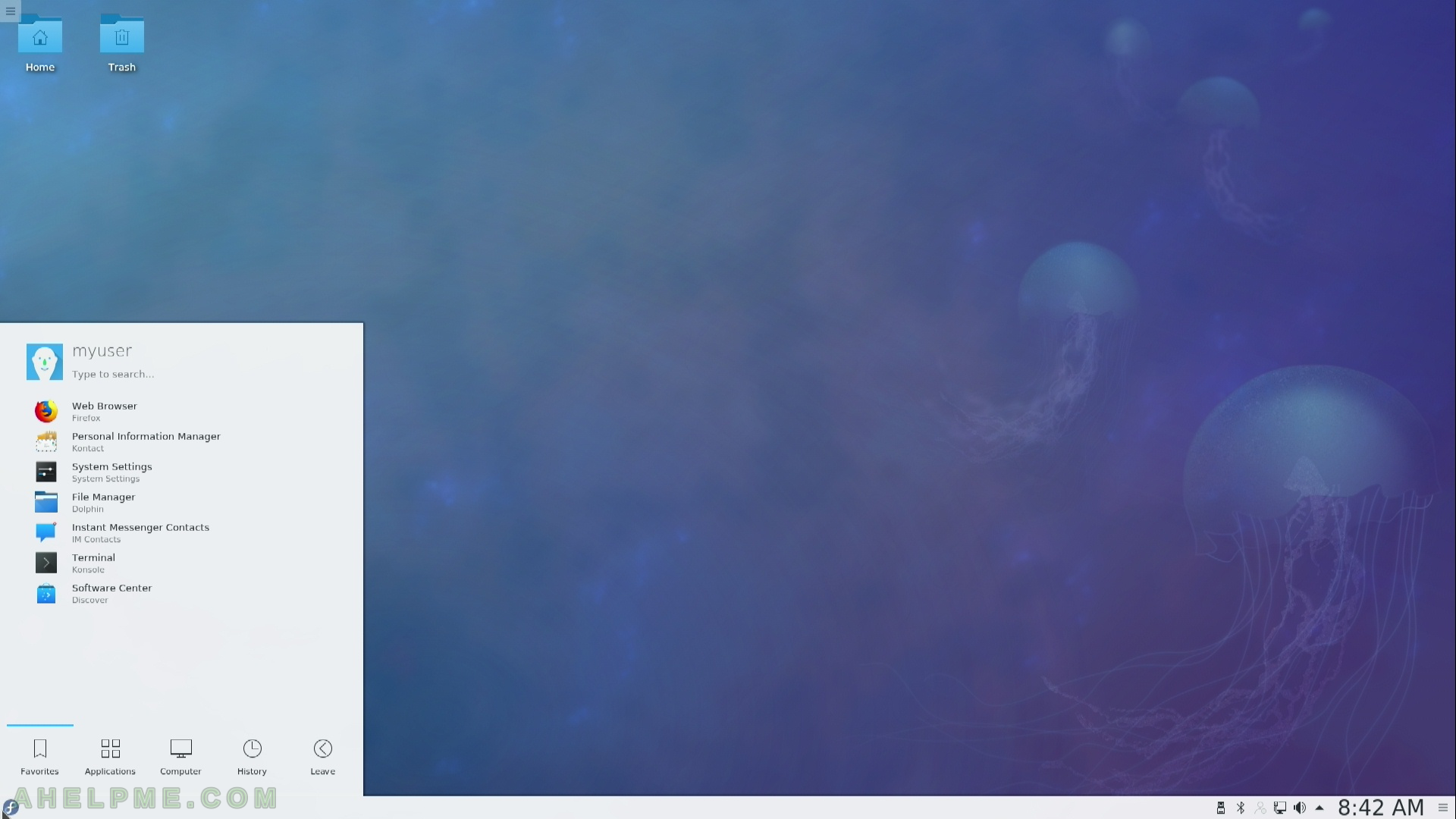
SCREENSHOT 5) The main menu in KDE Plasma.
You can change the toolbar and the manu, if you like you can remove them and to use other widgets to show your group of programs or folders.
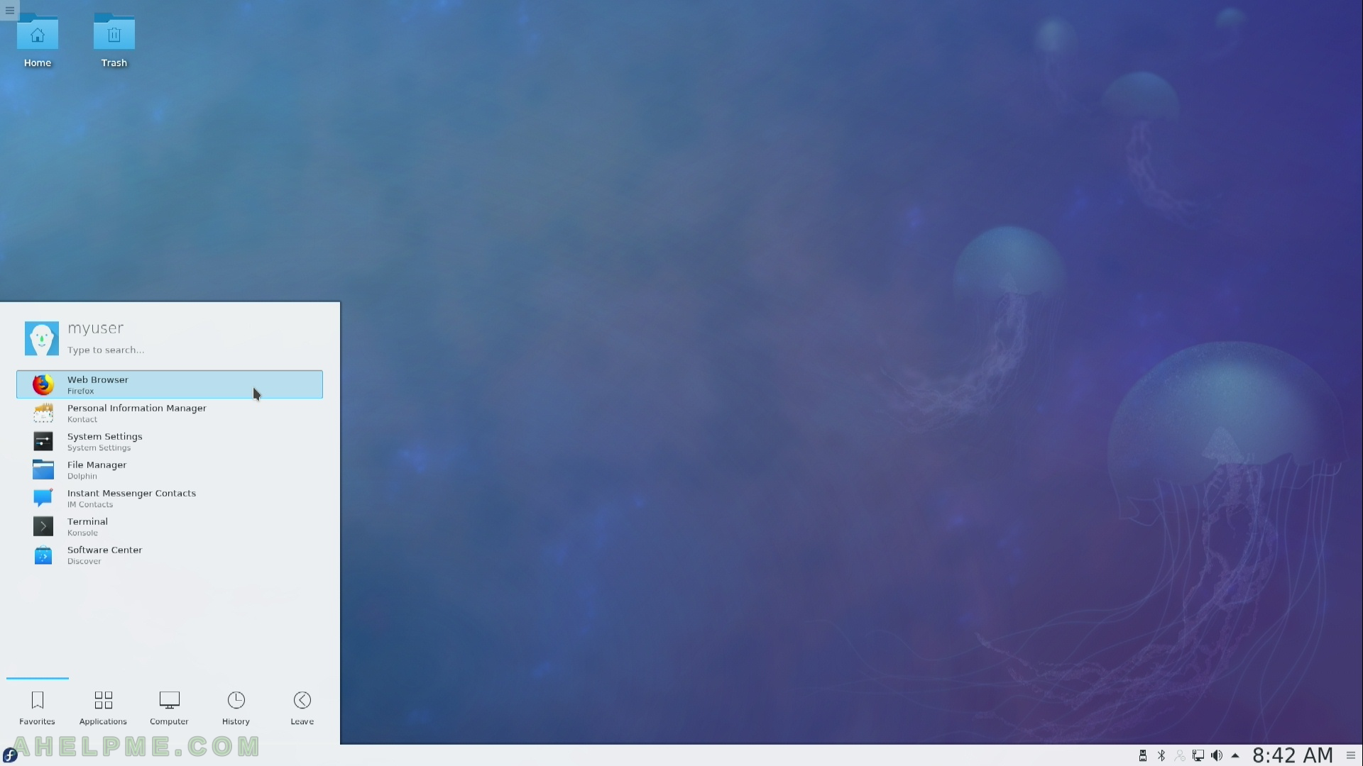
SCREENSHOT 6) Main menu in KDE Plasma Desktop – start Firefox.
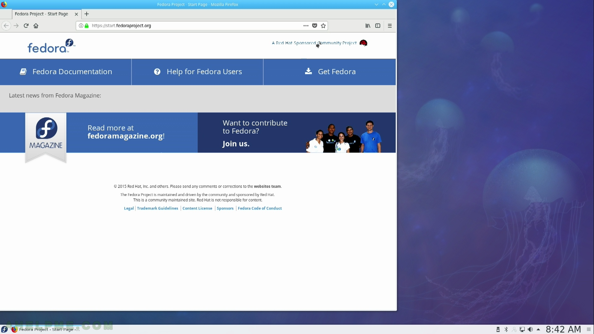
SCREENSHOT 7) Firefox started – look and feel
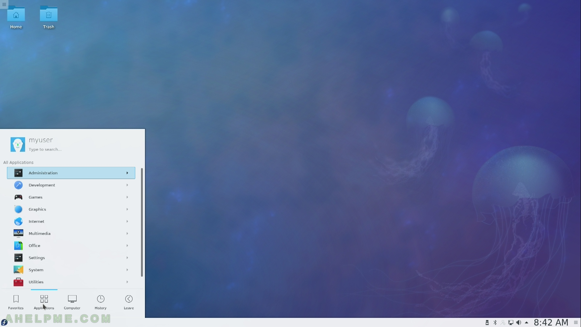
SCREENSHOT 8) Main menu and the first level of it
All applications with sub menus of Administration, Development, Games, Graphics, Internet, Multimedia, Office, Settings, System, Utilities.
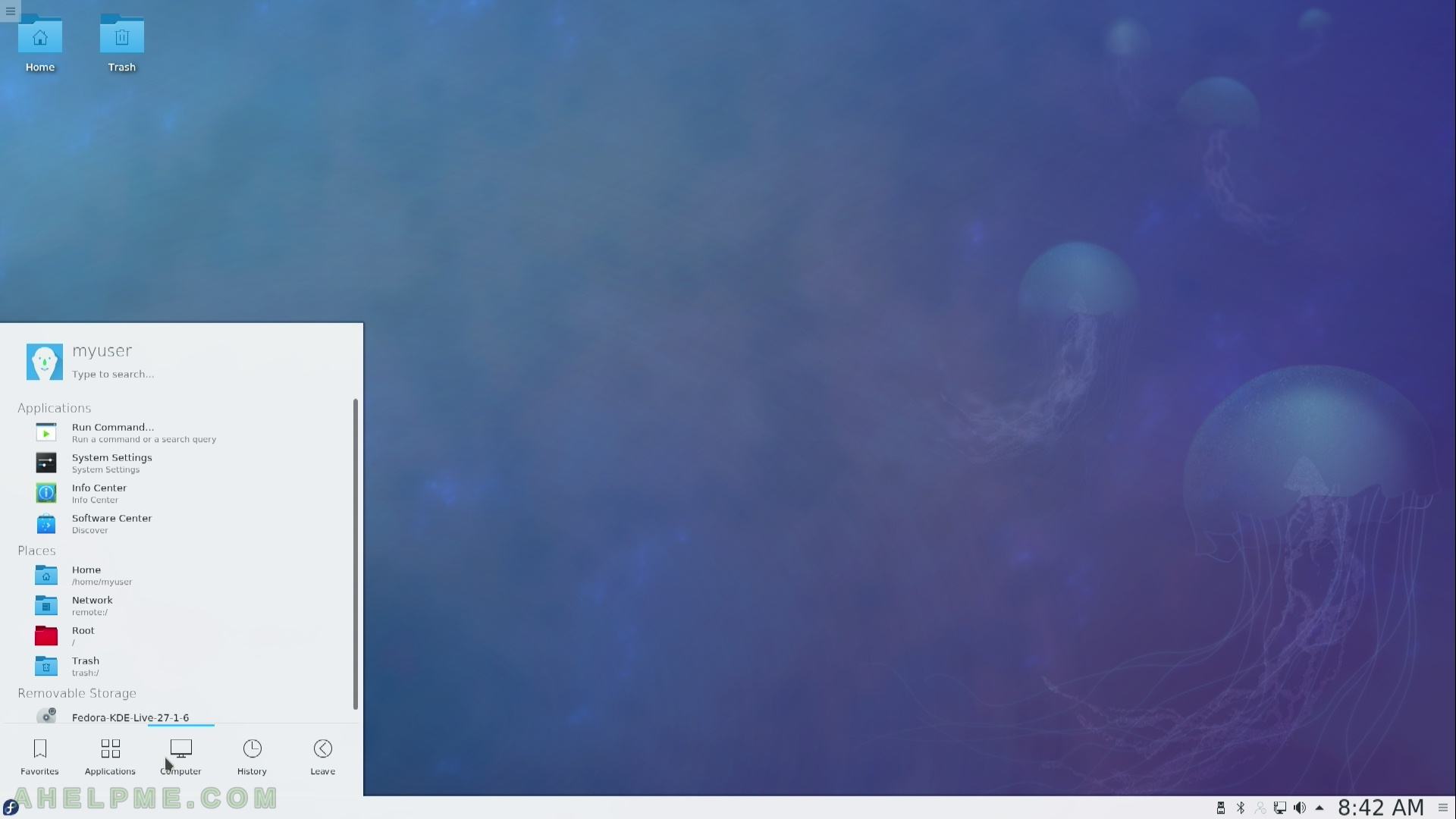
SCREENSHOT 9) Computer menu
SCREENSHOT 10) History of started programs and viewed documents from the main menu
