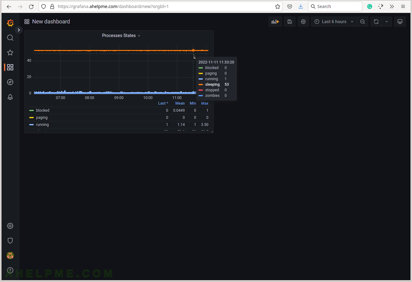
SCREENSHOT 11) Set the graph title to the right where is the graph options – Processes states.
The query is ready and several graph options follow.
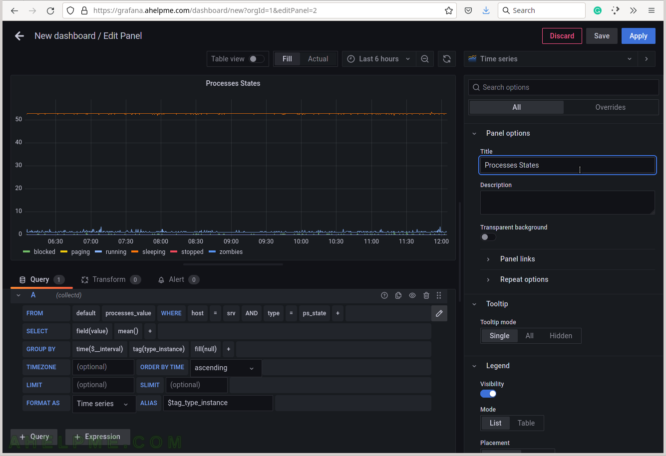
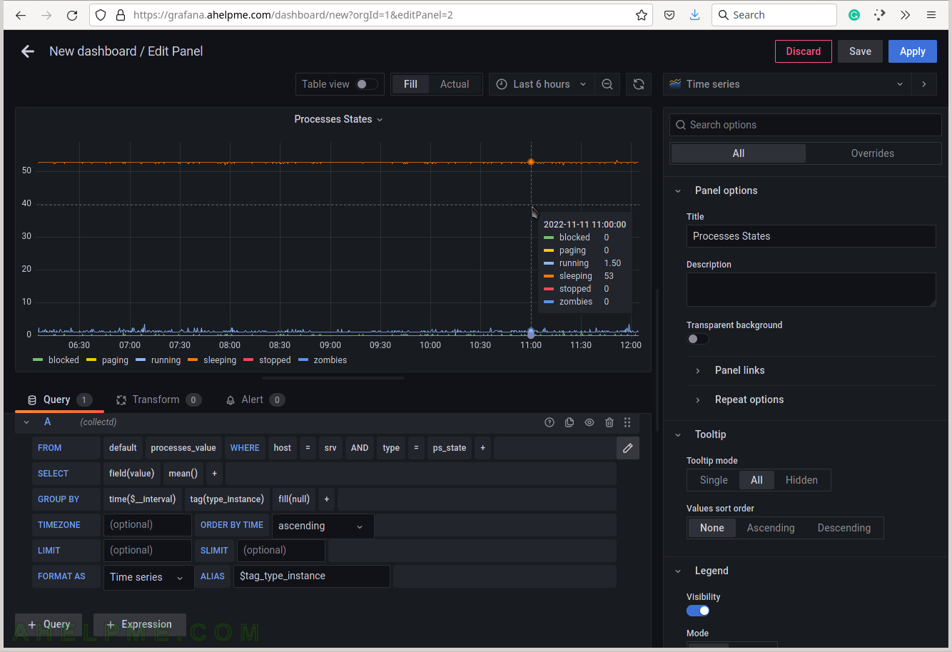
SCREENSHOT 12) Set the “Tooltip mode” to “All” to show all the queries’ results for a given time in the tooltip.
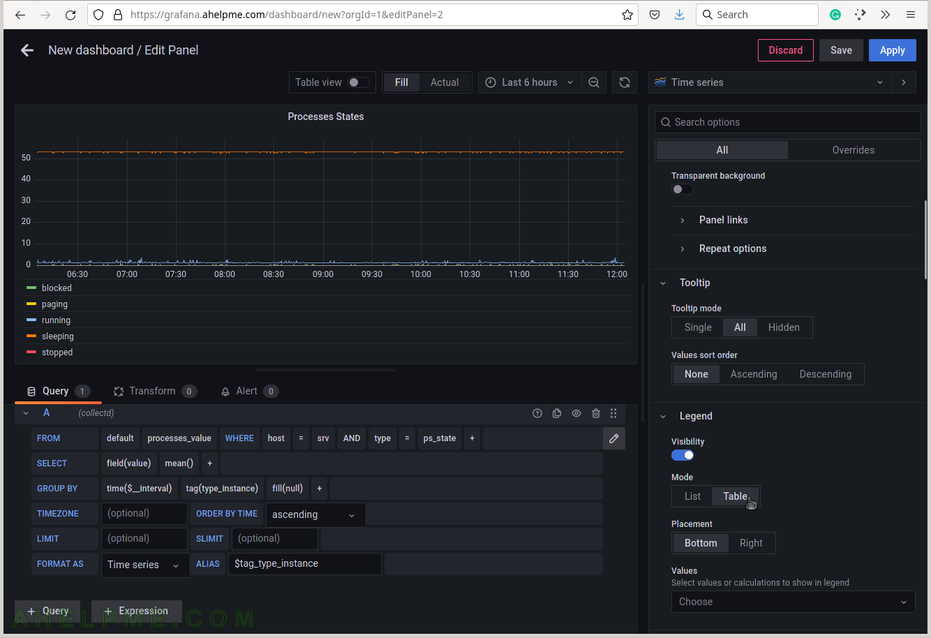
SCREENSHOT 13) Select the legend type “Table” for better visibility.
Scroll down if needed.
SCREENSHOT 14) Add additional values in the legend for the measurements like the current value of the measurements and so on.
Add “Last*” and select another values.
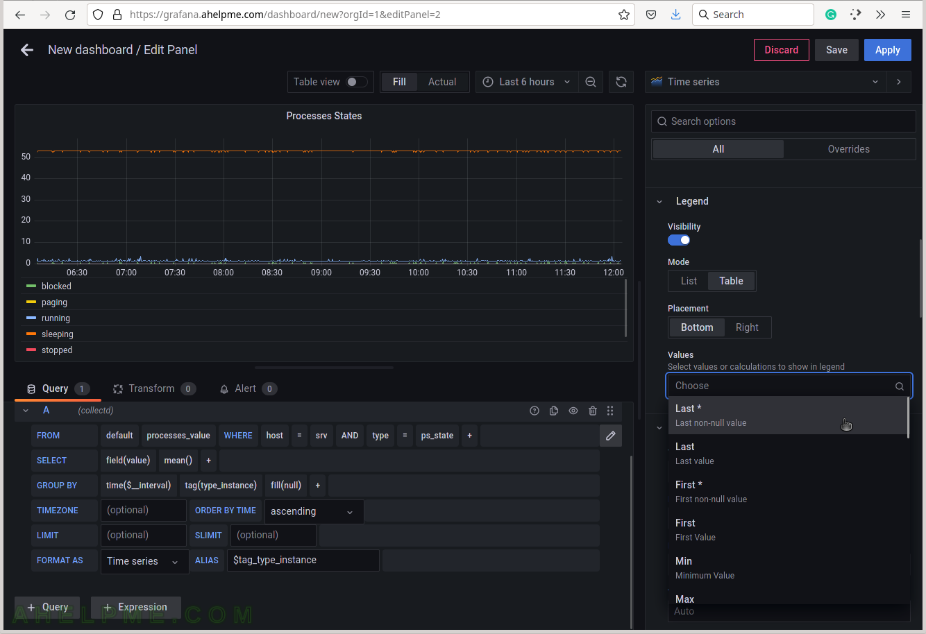
SCREENSHOT 15) 4 calculations are selected to be shown in the graph legend – Last, Mean, Min, Max.
These 4 calculations are meaningful for the current measurement – Processes states. There are many more in the drop-down list.
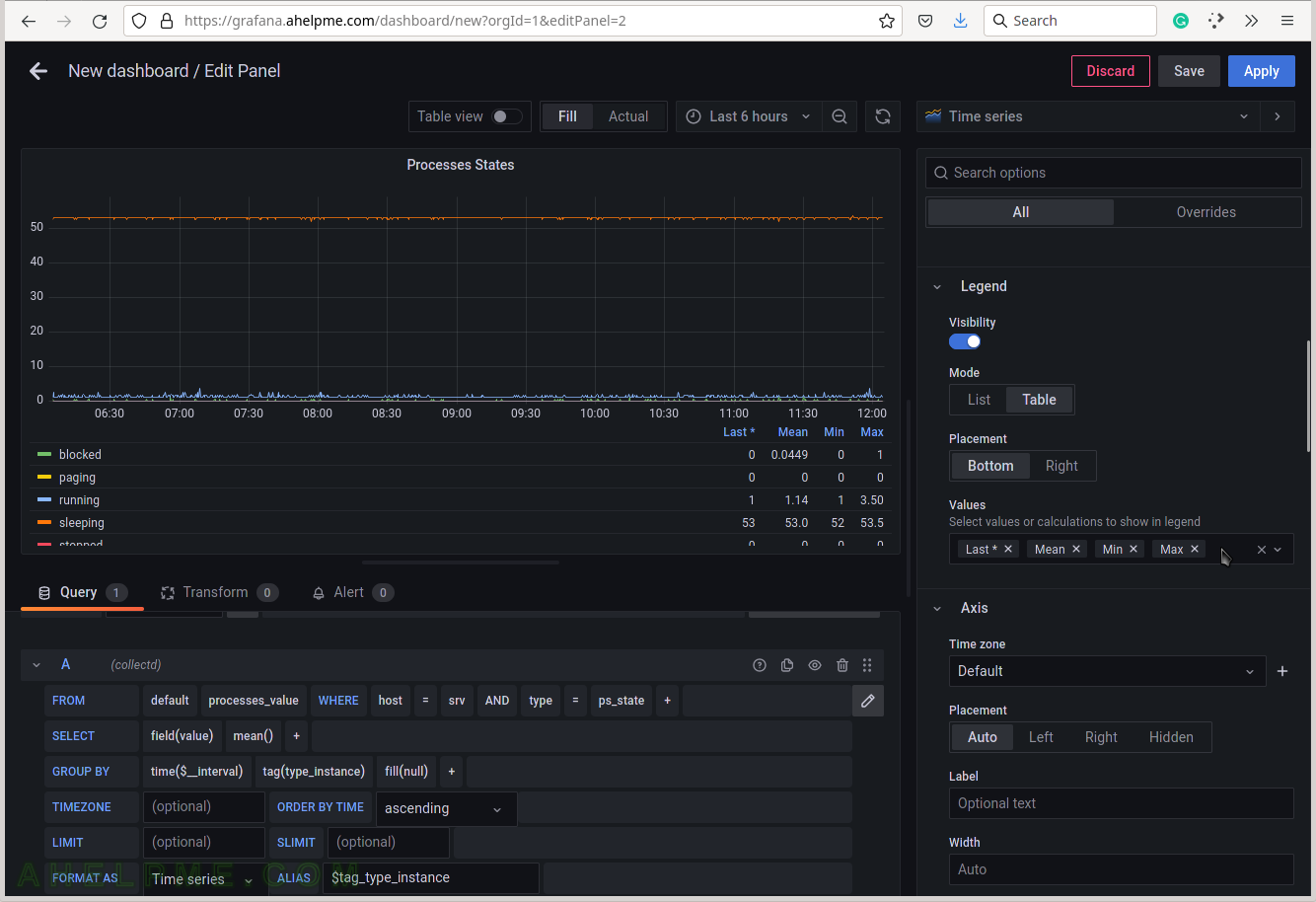
SCREENSHOT 16) Scrow down to the Graphs styles sub-menu and chose “Always” for the “Connect null values”
If there are some missing values there won’t be gaps in the graphs.
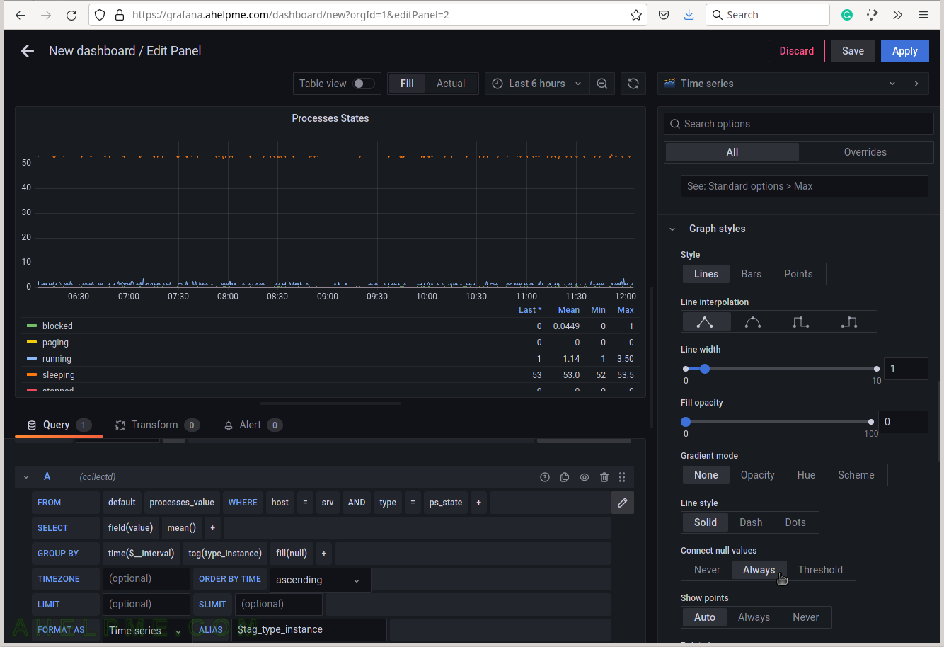
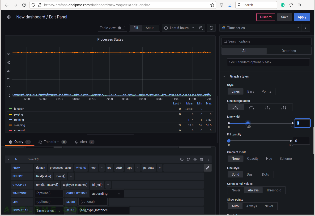
SCREENSHOT 17) Increase the lines width in the graph for better readability.
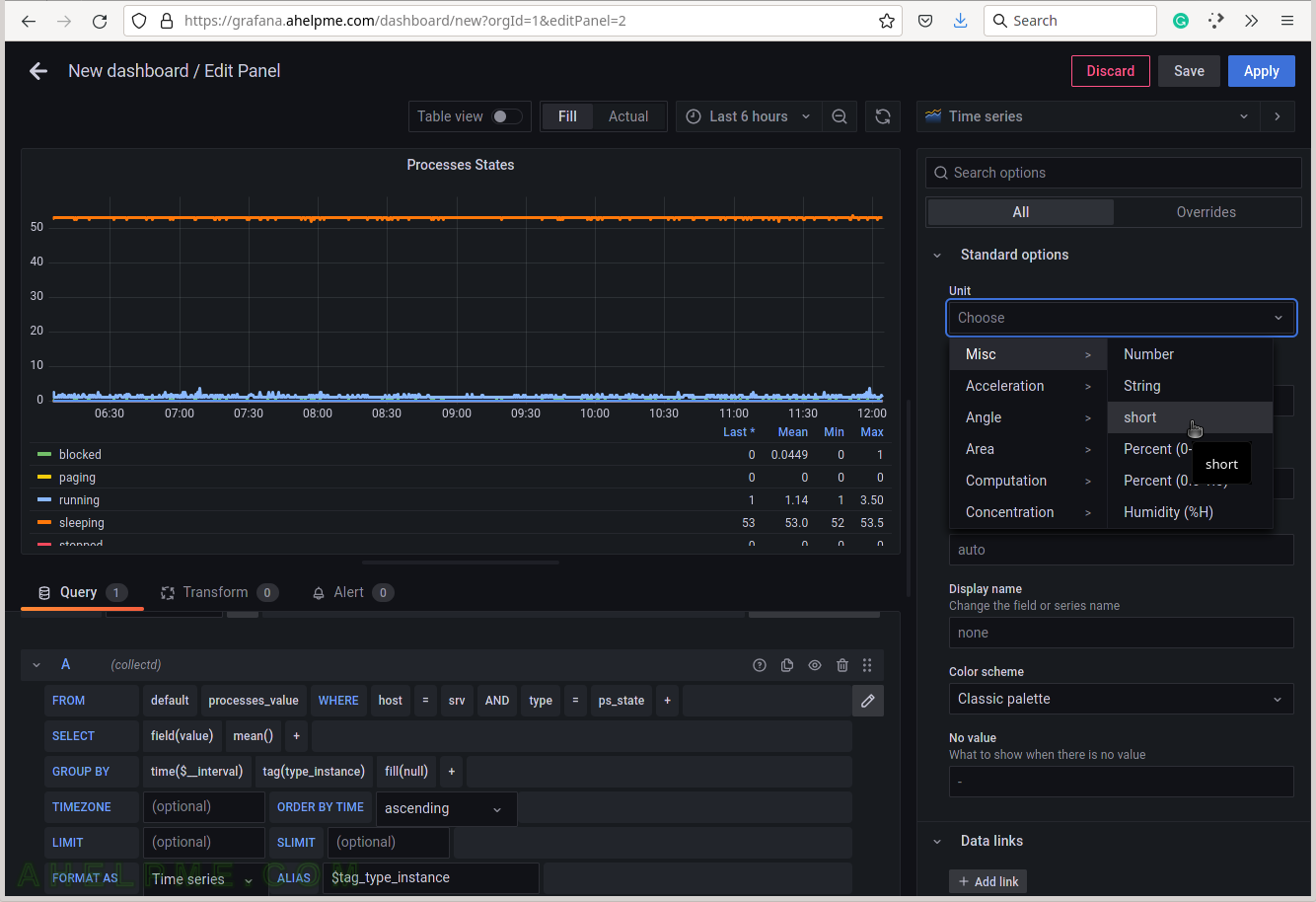
SCREENSHOT 18) The units of the processes states are just number from 0 to several thousands, so “short” or “Number” will be OK.
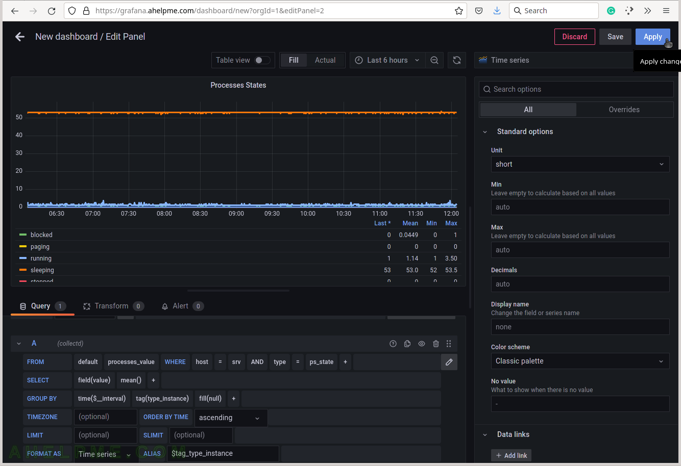
SCREENSHOT 19) Apply all the graph modifications.
SCREENSHOT 20) The Processes states graph with 6 lines is ready and can be resized.