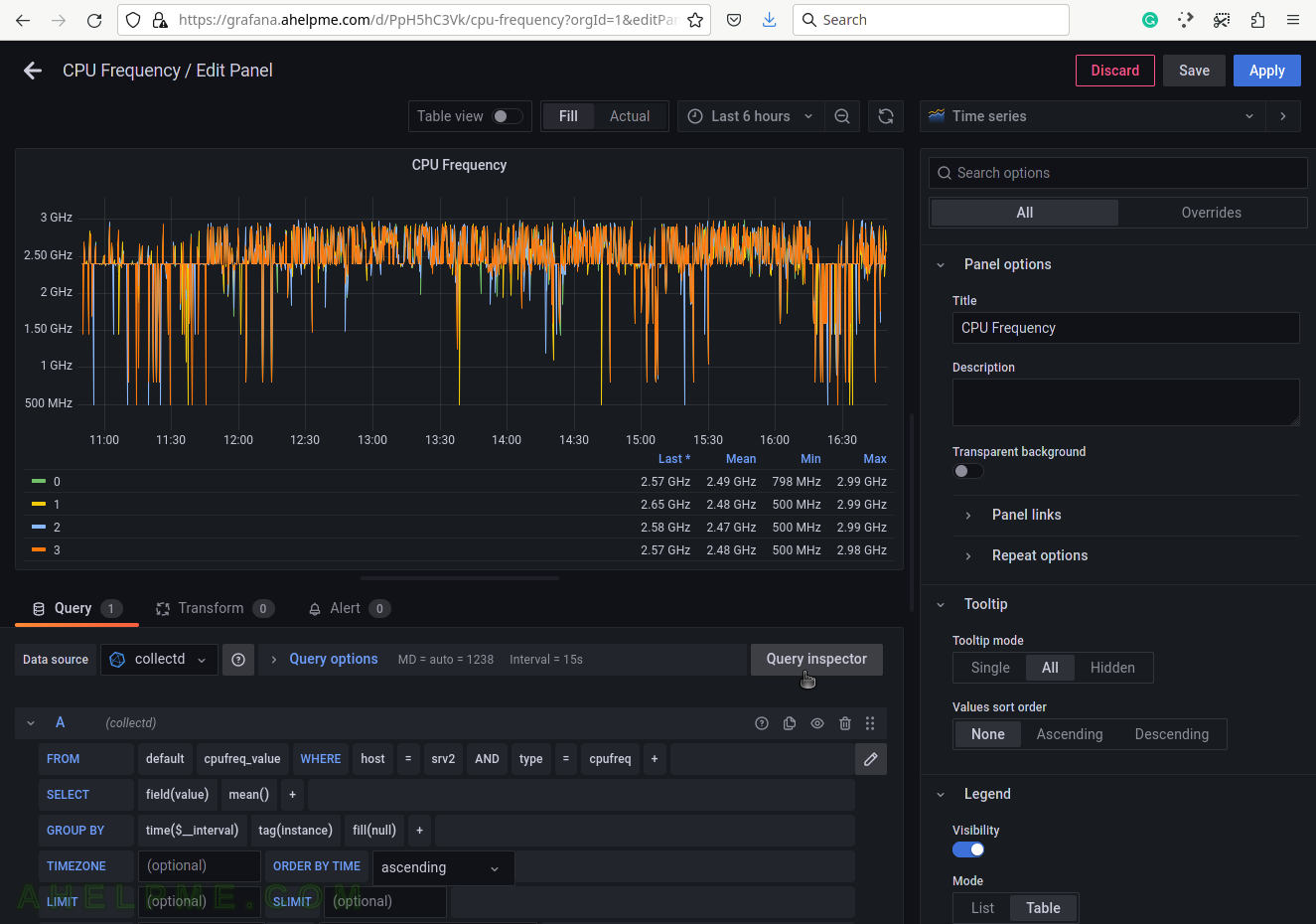
SCREENSHOT 31) Click on “Query Inspector” to see the values behind the graph and the query results or the real query sent to InfluxDB.
SCREENSHOT 32) The query in InfluxQL language, which is sent to the InfluxDB.
Some of the values are replaced with their actual values such as “$__interval“, which is based on what time frame is selected – “Last 6 hours”. If $__interval is not set on the query manually, it is a good idea to use the mean() function in the query (as in the example above).

SCREENSHOT 33) The Data tab in Query Inspector shows real values from the queries in a table form.
Multiple values of the idle measurement are shown. These values mey be cross-checked with the values from the special files /sys/devices/system/cpu/cpu*/cpufreq/scaling_cur_freq.

SCREENSHOT 34) Modifying the opacity of the graph.
The graph lines look better. The user can experiment with different style values.
