After the tutorial of Install Fedora Workstation 27 (Gnome GUI) this tutorial is mainly to see what to expect from a freshly installed Fedora 27 Workstation – the look and feel of the GUI (Gnome – version 3.26).
The idea of this tutorial is just to see what to expect from Fedora 27 Workstation (Gnome) – the look and feel of the GUI, the default installed programs and their look and how to do some basic steps with them. Here you’ll find more than 130 screenshots and not so many text we do not want to turn this review of many text and version information and 3 meaningless screenshot, which you cannot see anything for the user interface, which these days is the primary goal of a Desktop system. You can expect more of this kind reviews in the future…
screenshot 1) The default desktop look after logging
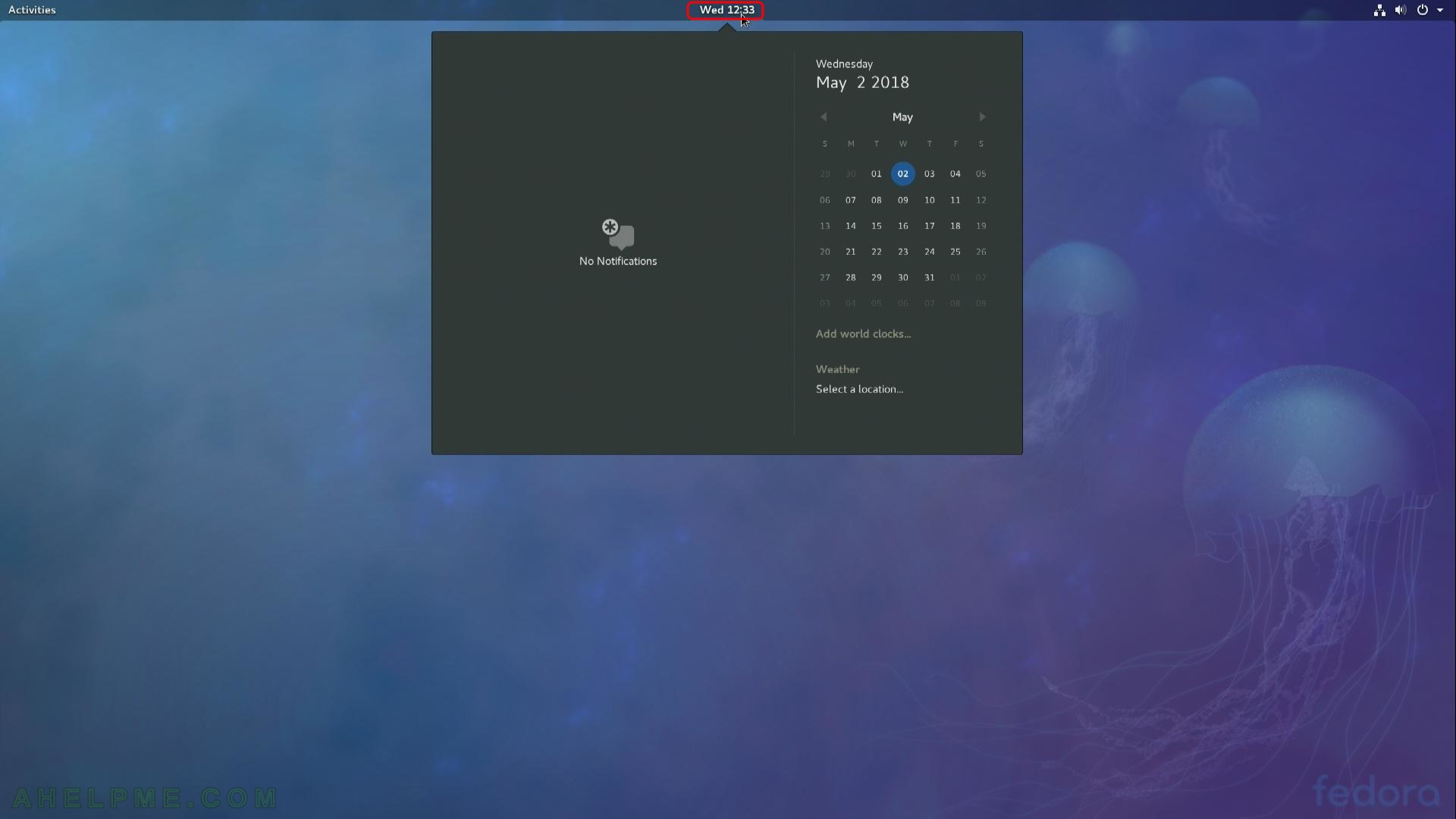
screenshot 2) Click on the time and you’ll see the notifications, the calendar of the current month and weather forecast if location set
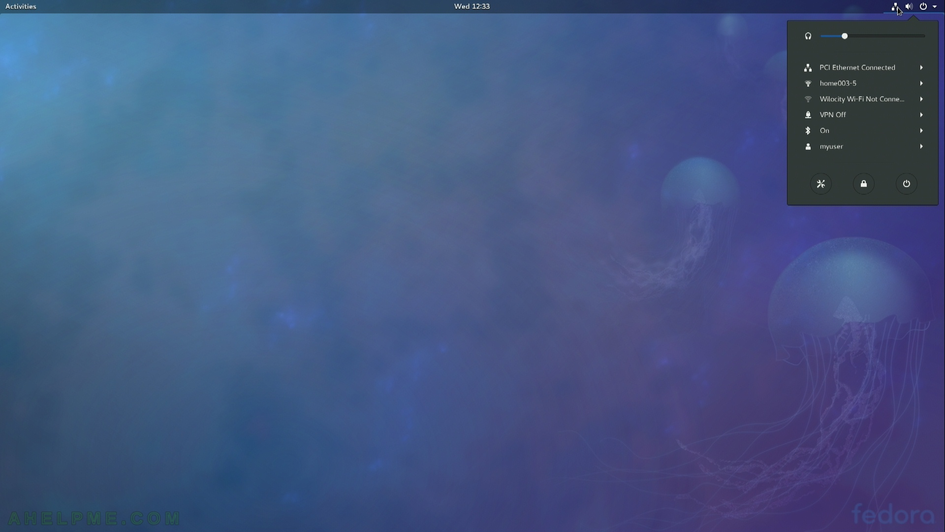
screenshot 3) Context menu right top of the screen – click on the icons of the networking, speaker and power button.
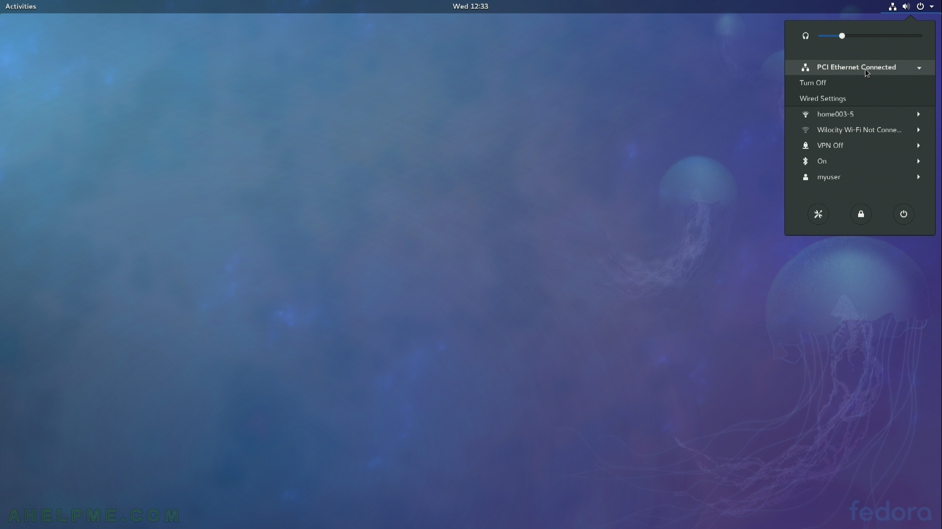
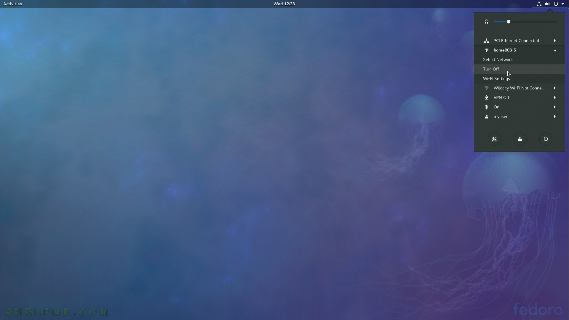
Here you have shortcuts for configuring all the network available to your computer including VPN networks. In addition you can change volume and power off the computer, there is also a button for the Gnome settings.
screenshot 4)
screenshot 5)
screenshot 6)

screenshot 7)
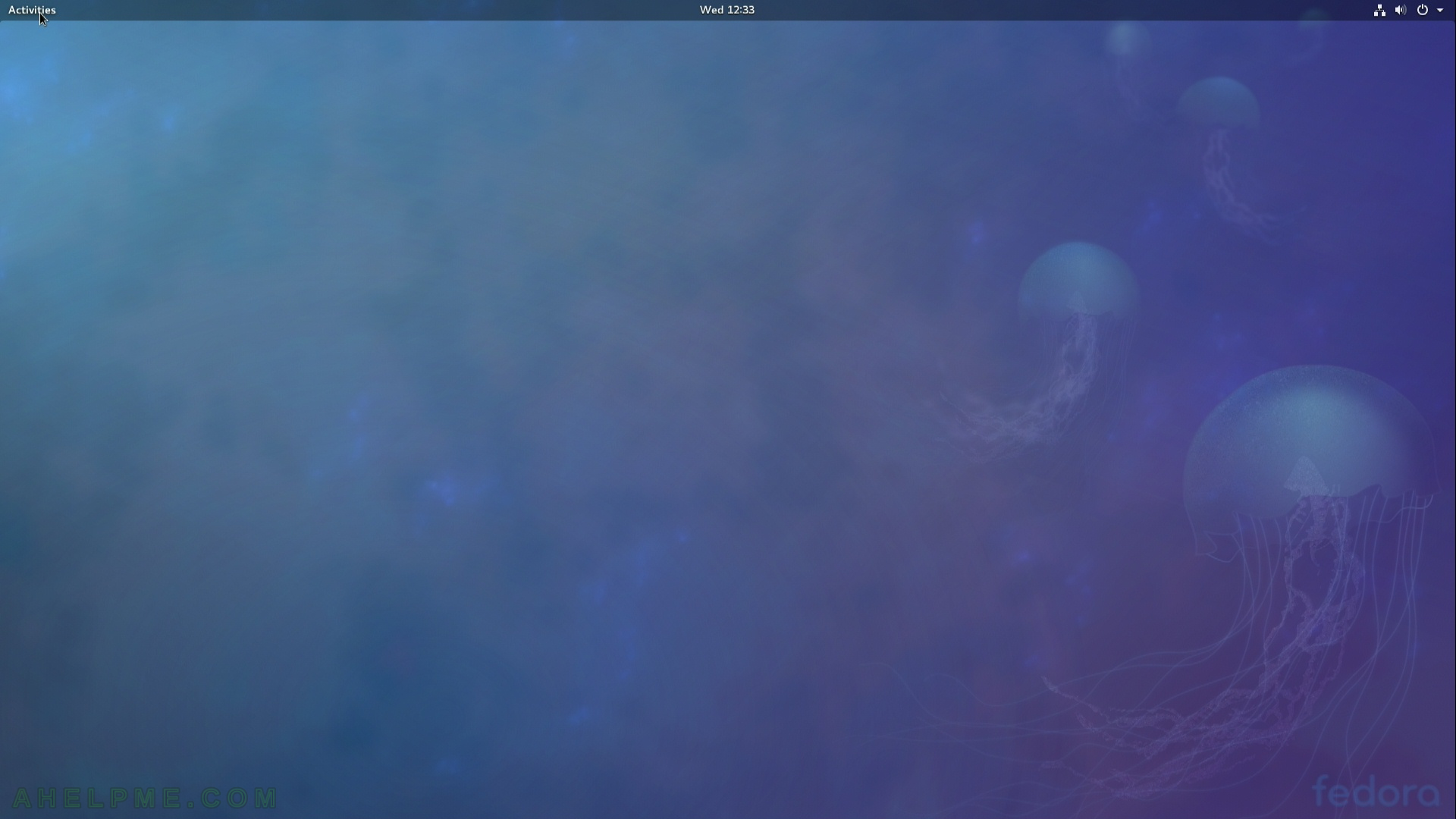
screenshot 8)
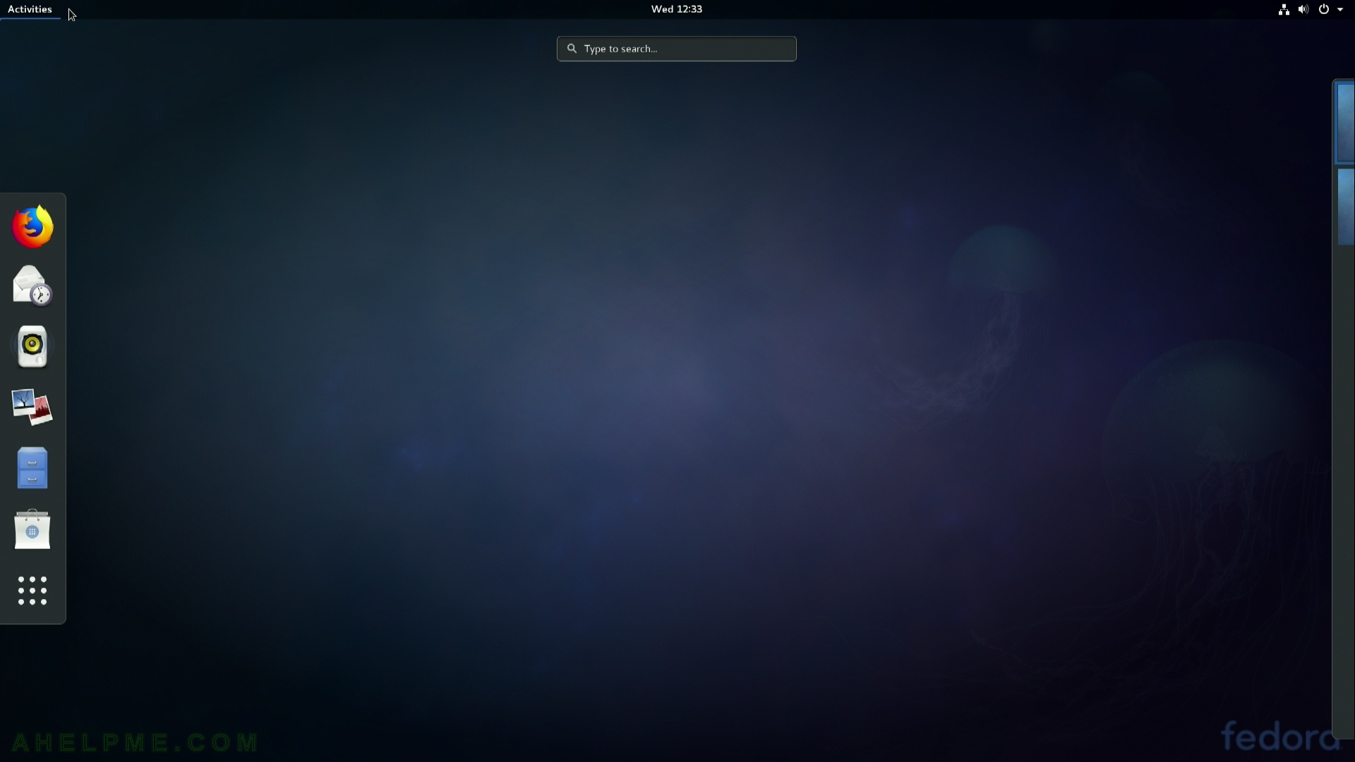
screenshot 9)
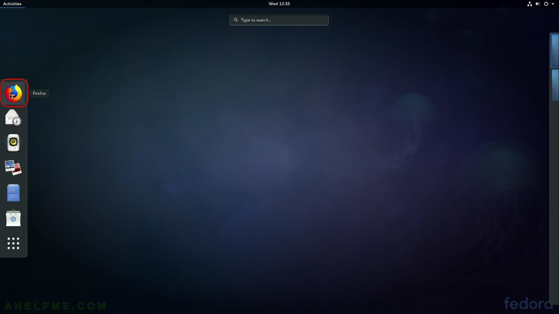
screenshot 10)
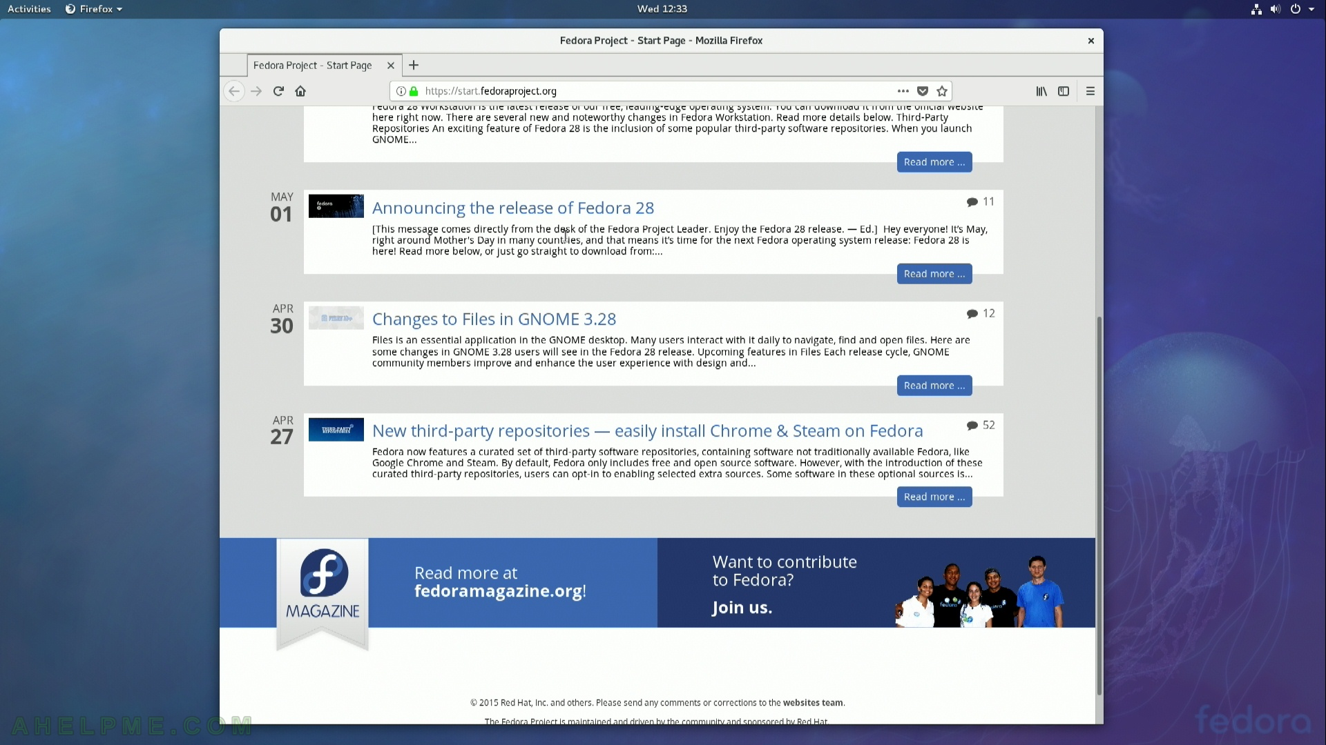

One thought on “Review of freshly installed Fedora 27 Workstation (Gnome GUI)”