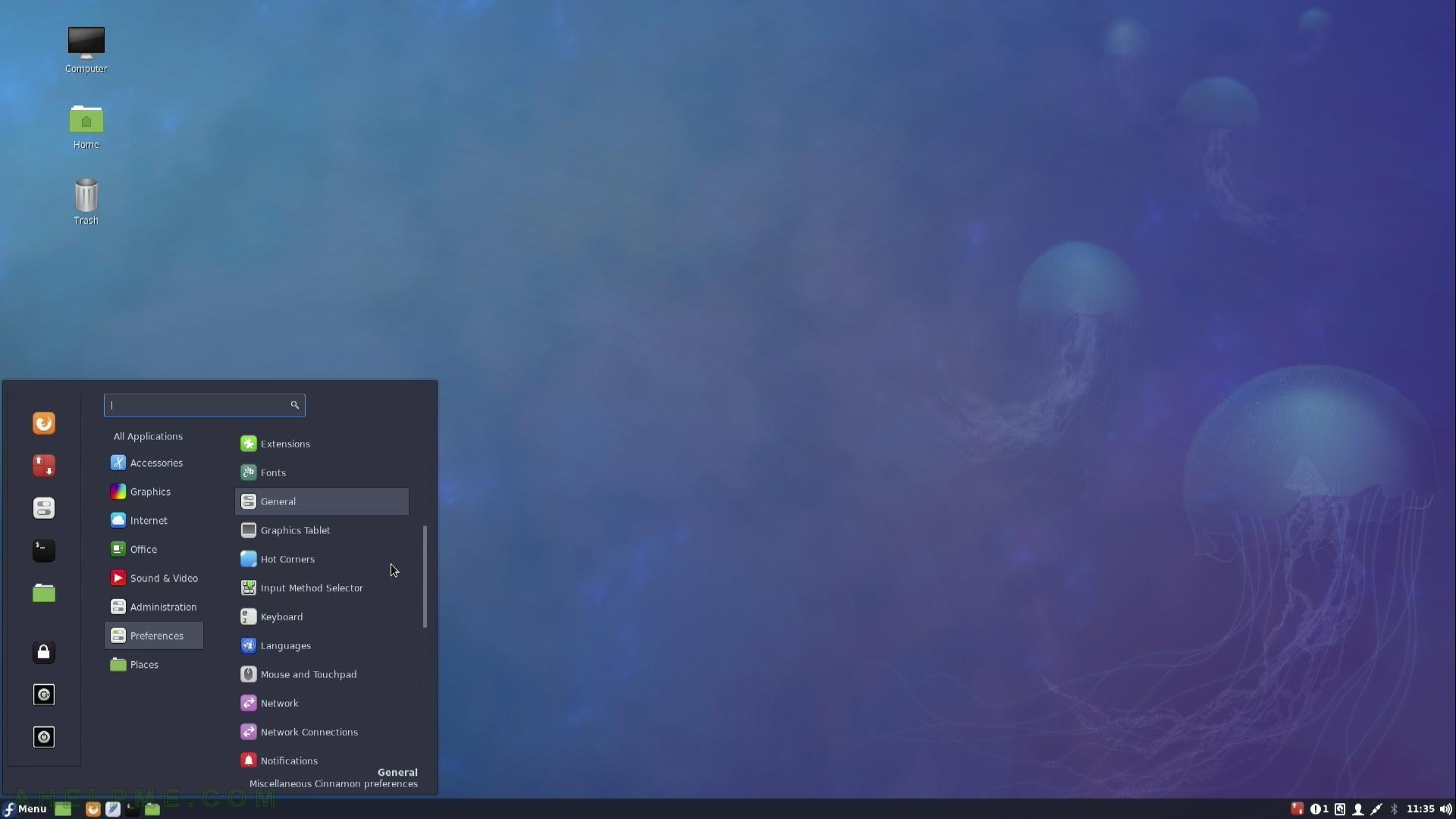
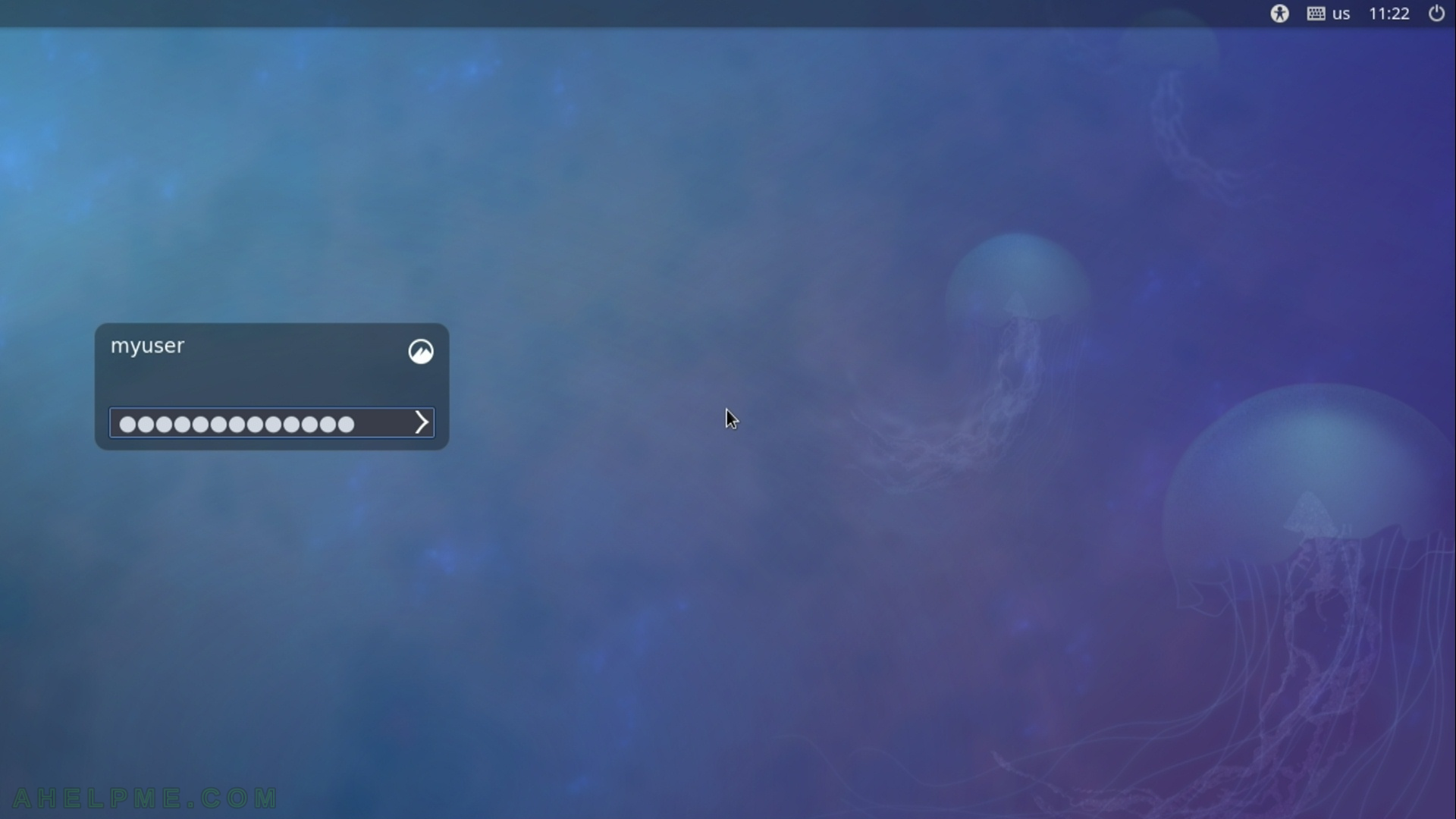
After the tutorial of Install Fedora 27 Cinnamon Desktop this tutorial is mainly to see what to expect from a freshly installed Fedora 27 Cinnamon – the look and feel of the Cinnamon GUI – http://developer.linuxmint.com/projects/cinnamon-projects.html
The idea of this tutorial is just to see what to expect from Fedora 27 Cinnamon – the look and feel of the GUI, the default installed programs and their look and how to do some basic steps with them, it is included also screenshots of the Cinnamon settings programs. Here you’ll find more than 100 screenshots and not so many text we do not want to turn this review of many text and version information and 3 meaningless screenshot, which you cannot see anything for the user interface, which these days is the primary goal of a Desktop system. You can expect more of this kind reviews in the future…
Cinnamon derives from GNOME 3 and it follows the traditional desktop conventions. After the release of GNOME 3 and GNOME Shell (and abandoning GNOME 2) a fork of GNOME 3 was made and Cinnamon was born to follow traditional desktop not the “shell” interface of GNOME 3. At present Cinnamon is not a front-end on top of the GNOME any more despite it still uses GTK+. If you search for a GTK+ based GNOME 2 or xfce similar linux desktop GUI you might reach a good option with Cinnamon. Its look and feel is more like KDE than MATE, which follows more strictly GNOME 2 layout.
Cinnamon is developed by Linux Mint team, which is yet another Linux distro.You can check it here – https://linuxmint.com/ As you may see from the screenshots below the main idea is to have a taskbar situated bottom of the screen with a “start” button and all programs arranged in different categories – the traditional Desktop behavior. The desktop feels fast, but there are reports of using greater memory footprint.
SCREENSHOT 1)
SCREENSHOT 2)
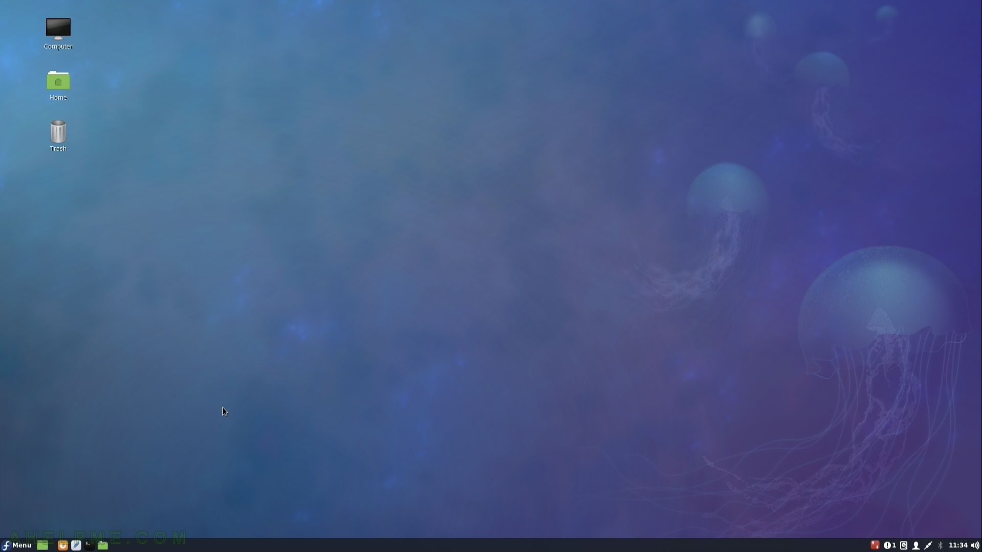
SCREENSHOT 3)
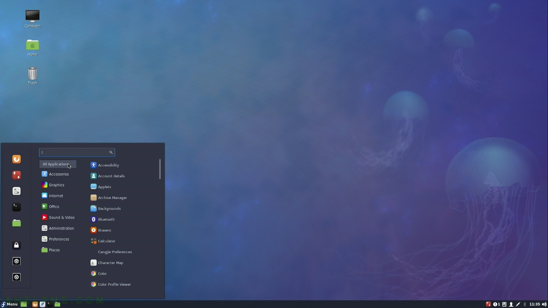
SCREENSHOT 4)
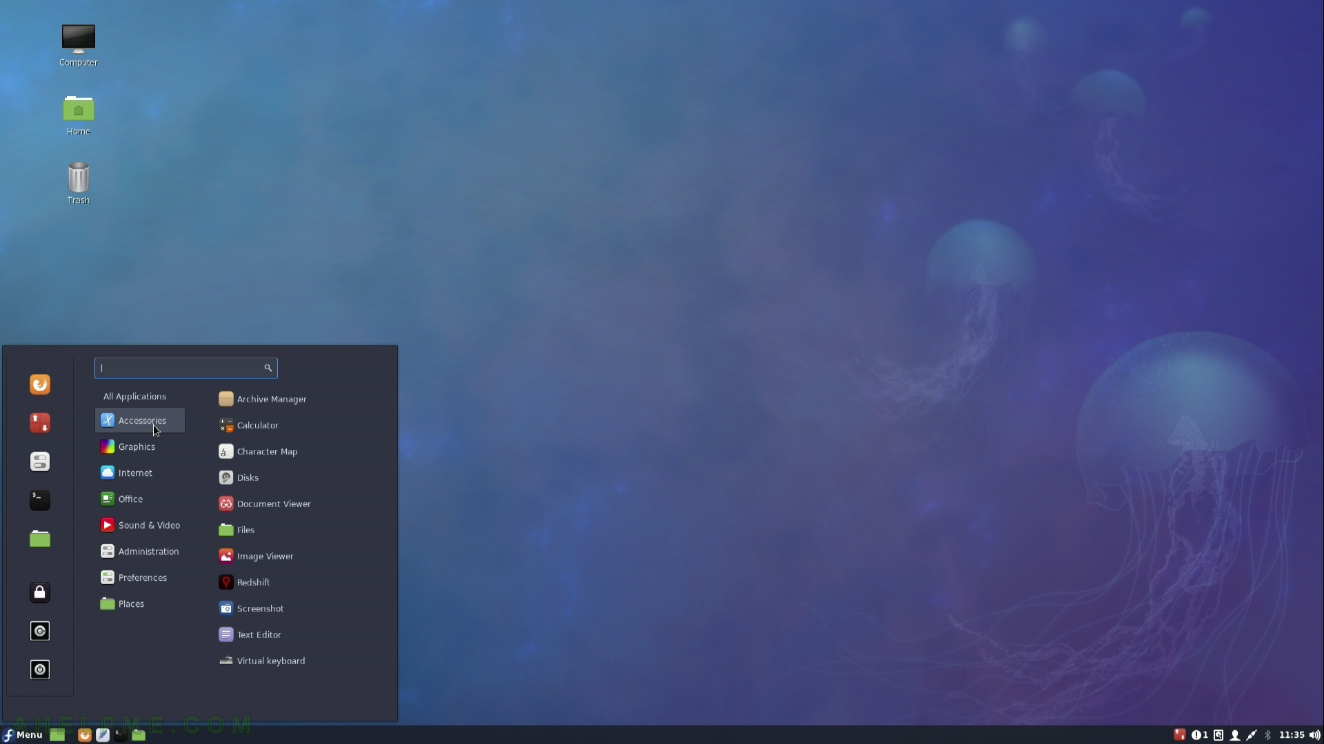
SCREENSHOT 5)
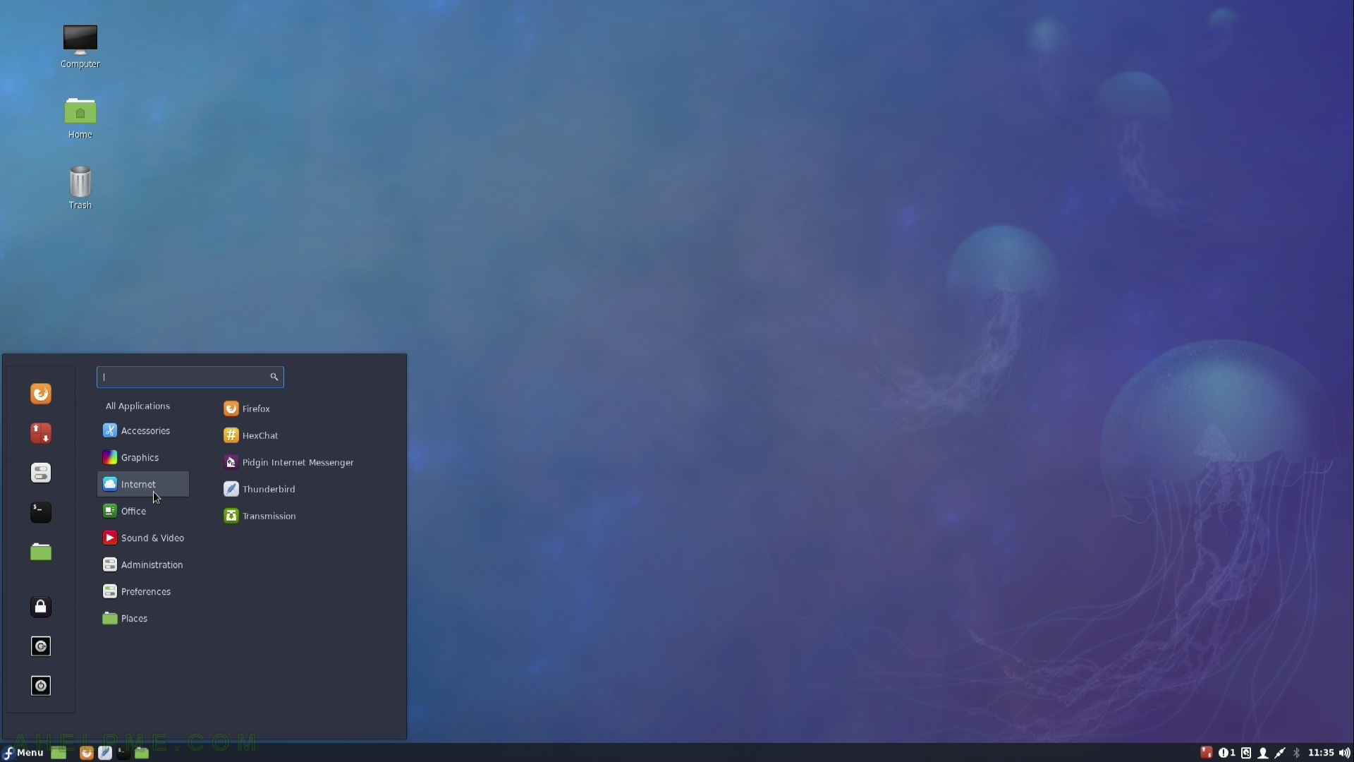
SCREENSHOT 6)
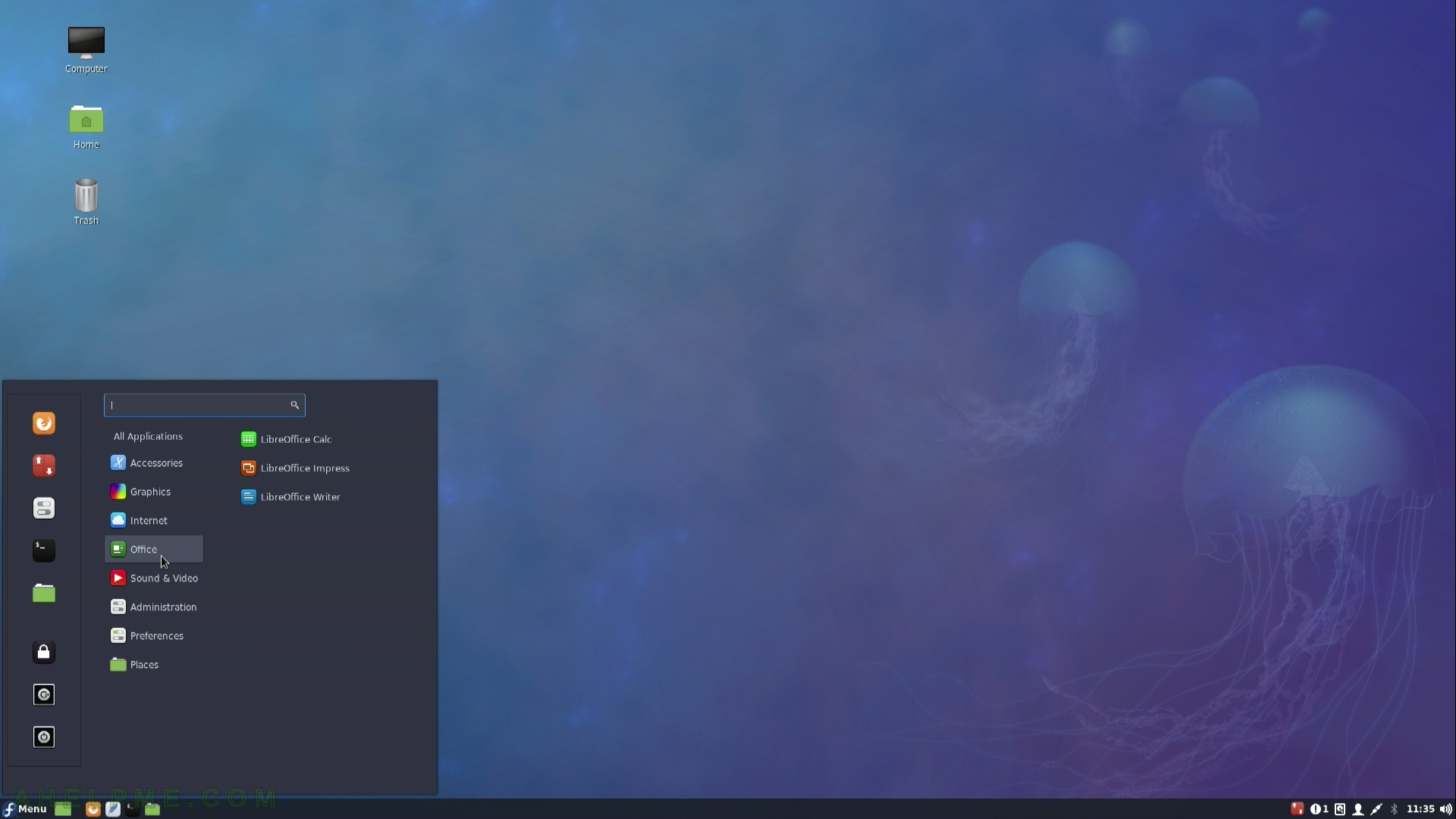
SCREENSHOT 7)
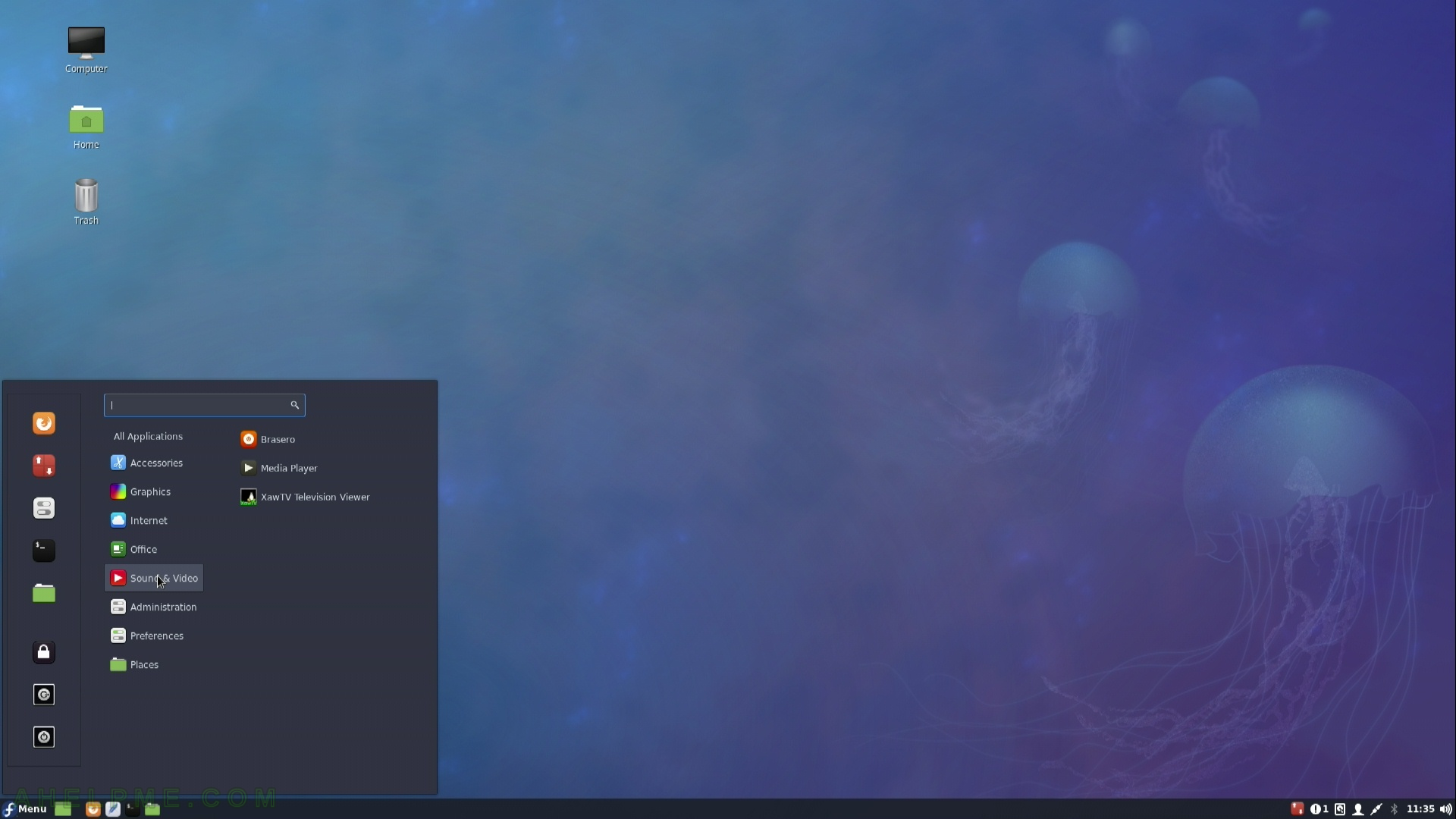
SCREENSHOT 8)
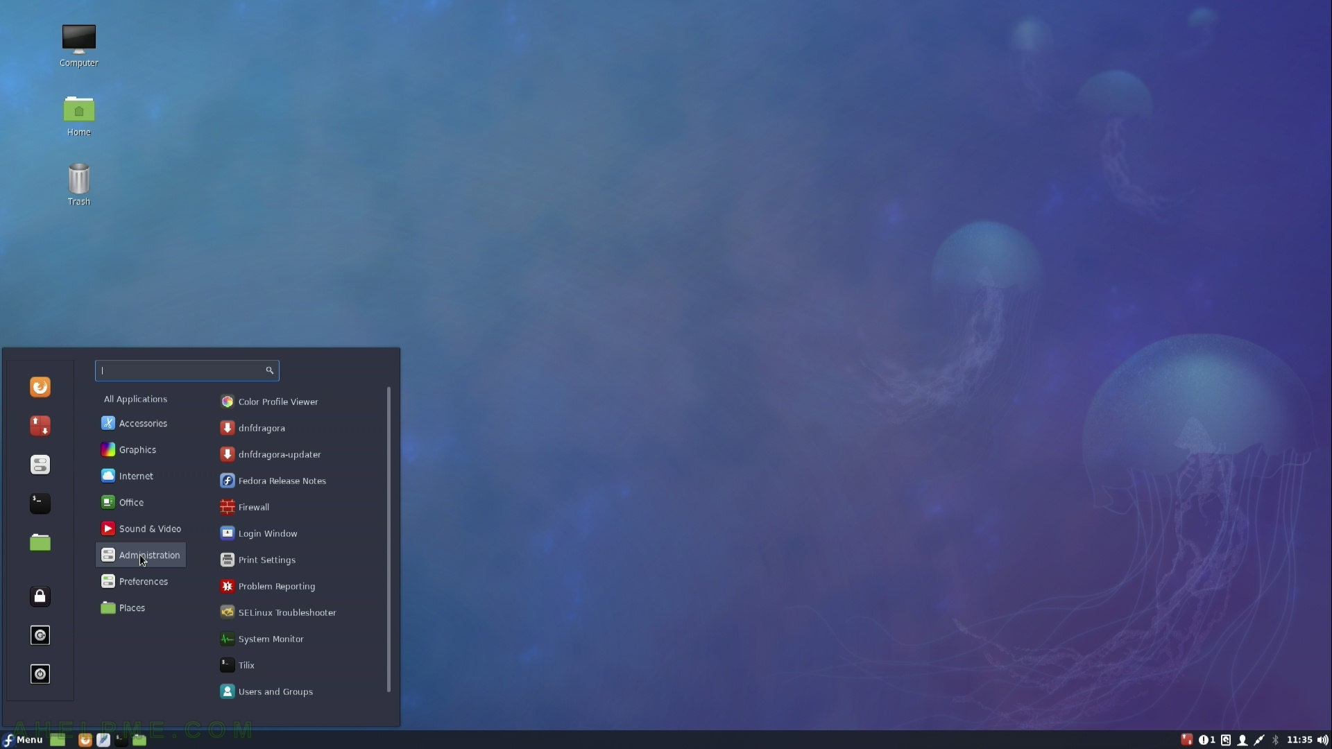
SCREENSHOT 9)
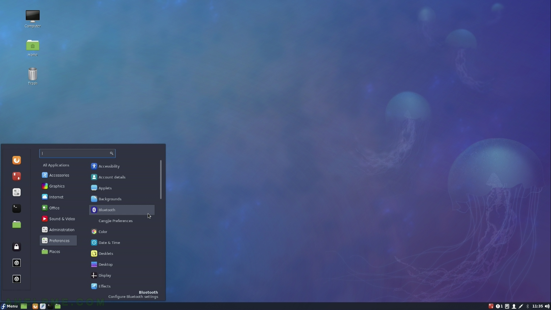
SCREENSHOT 10)
